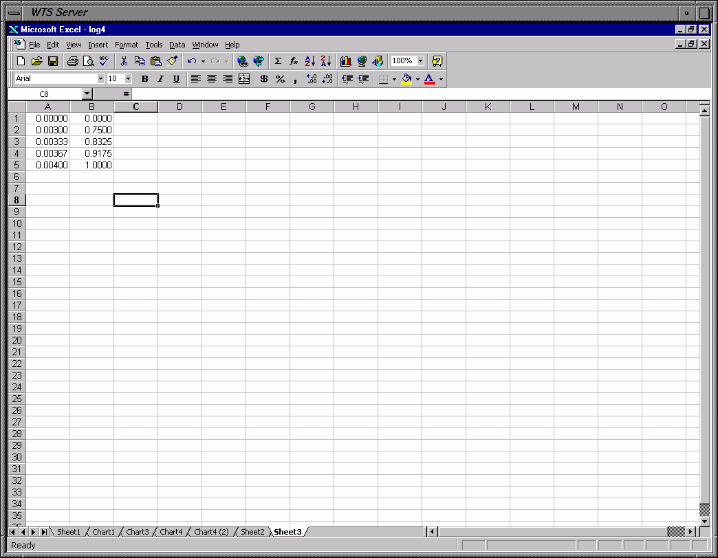
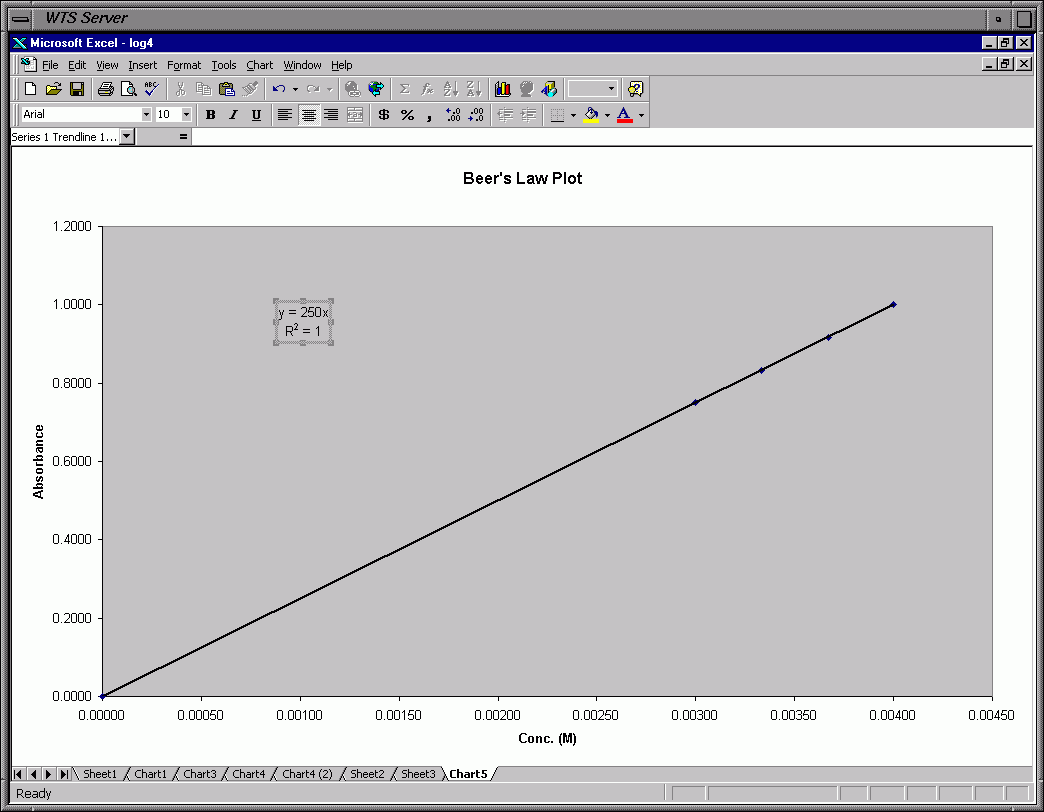
The following are images of how to use Excel to create the data tables and the
graphs.  I made up data so that it fits a first order rate law, r=k[A].  You may
get different results.  That is what you are supposed to be determining from your data.
I also used "perfect" data.

I have added the Beer's Law plot.  I am assuming the Beer's Law graph (which
you force through the origin) has a slope of 250 M-1.  I generated the
absorbance data for the boiled solutions so it would have this slope.

I am assuming a starting concentration for Cr3+ of 3.00 x 10⁻³, 3.33 x 10⁻³,
3.67 x 10⁻³ and 4.00 x 10⁻³ for solutions 1, 2, 3 and 4, respecitively.  The time
is in minutes.  The rate constant that I assumed is 0.010 min-1, as seen in graph 2.
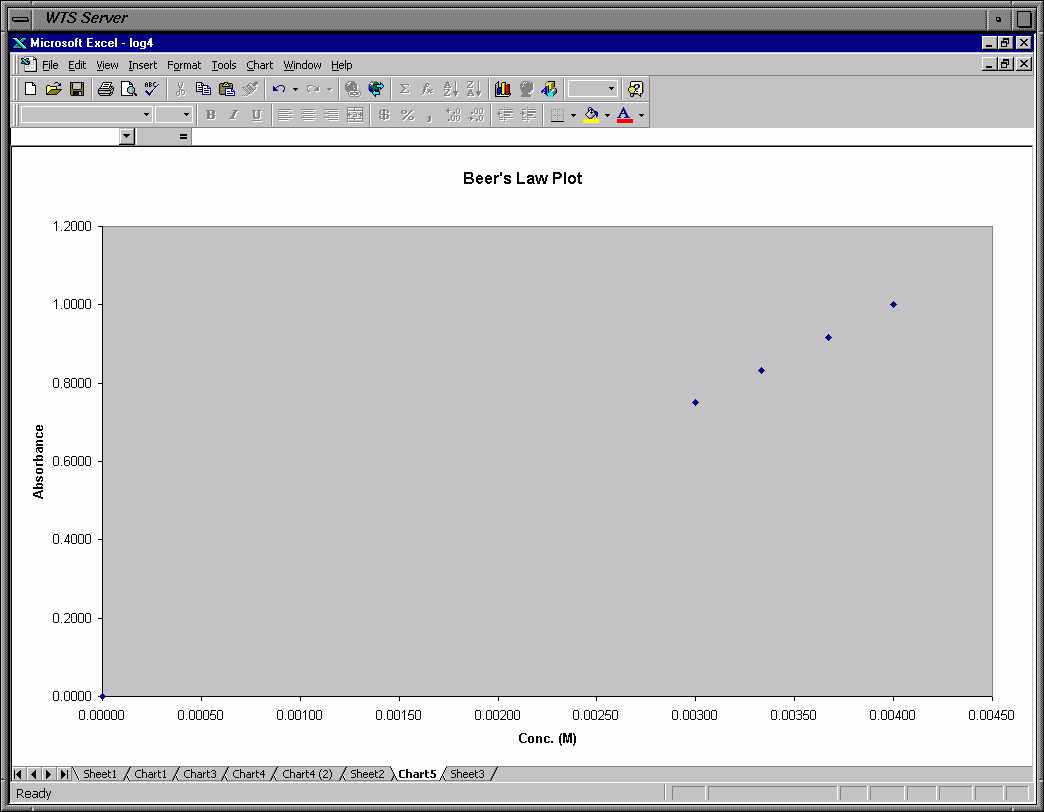
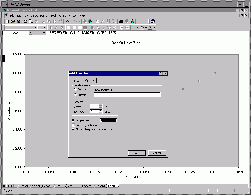
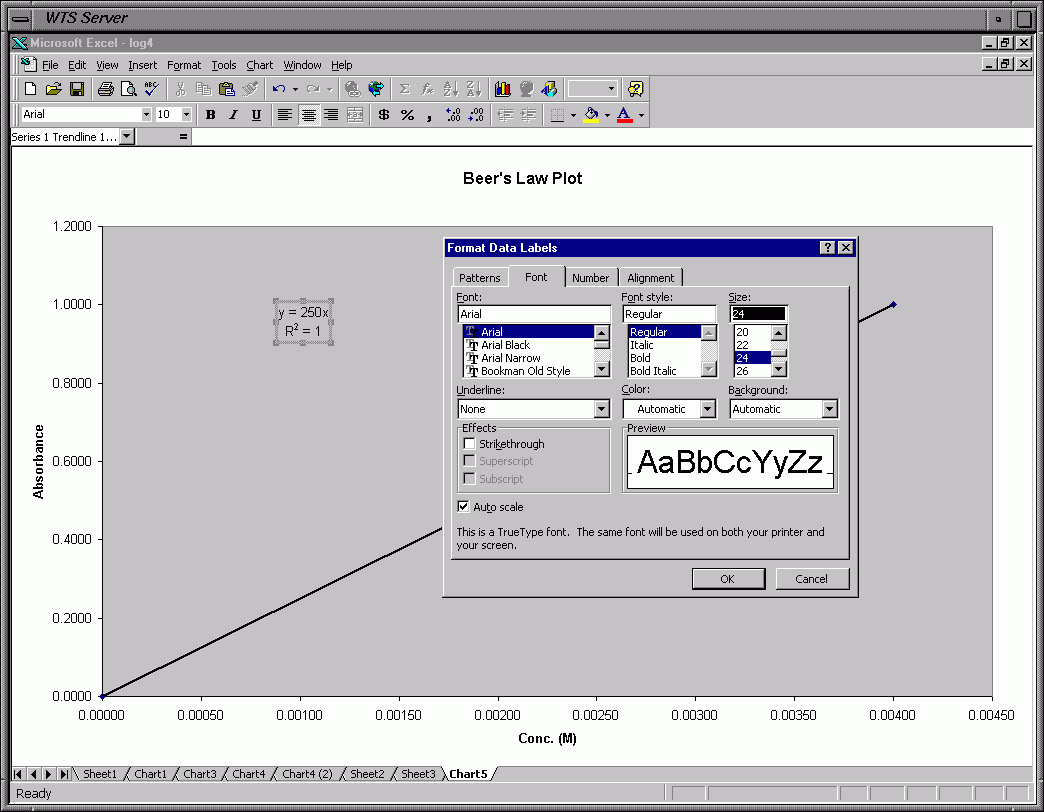
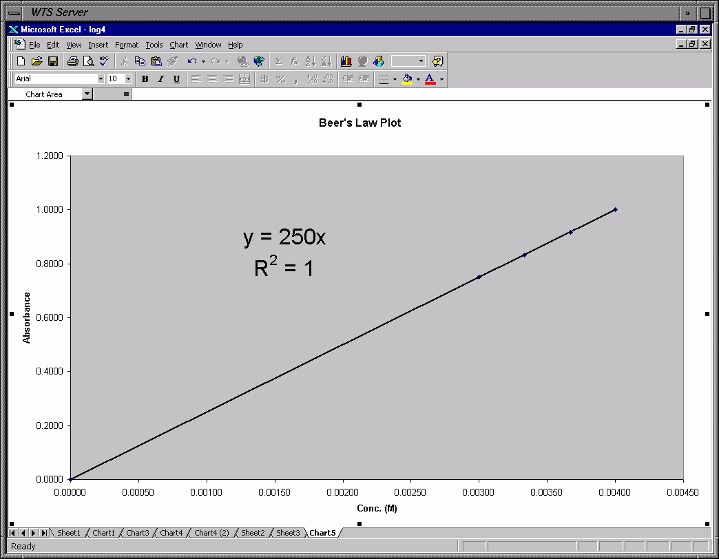
This section shows Excel frames for Beer's Law (A = m * C), where A=absorbance,
C=concentration, m=constant.  I am assuming the Beer's Law graph (which you do
just like the graphs below but you force through the origin) has a slope (m)
of 250 M-1.  Your line must go through the origin (0,0) for the Beer's Law plot
and fit the other points as best it can while passing through the origin.
Note that in the data table you include the point (0,0) as a data point so
there are 5 data points (1 for the origin and 4 for the 4 boiled solutions).
You can force a line through the origin in Excel for the linear regression.
There is a checkbox in the "trendline" window under the options tab for
setting the intercept and forcing the line through this intercept.  By
default it is set to pass through the origin (point (0,0)).  You can see
this in Frame 0k of the demo (frame 40 shows a line not forced through a
particular intercept).  You need the slope from this plot to calculate the
[Cr(EDTA)-] from the absorbance for the 4 data tables.  As I said above,
I used "perfect" data so my line goes through all the points (R2=1).
Your line will not be so "nice".
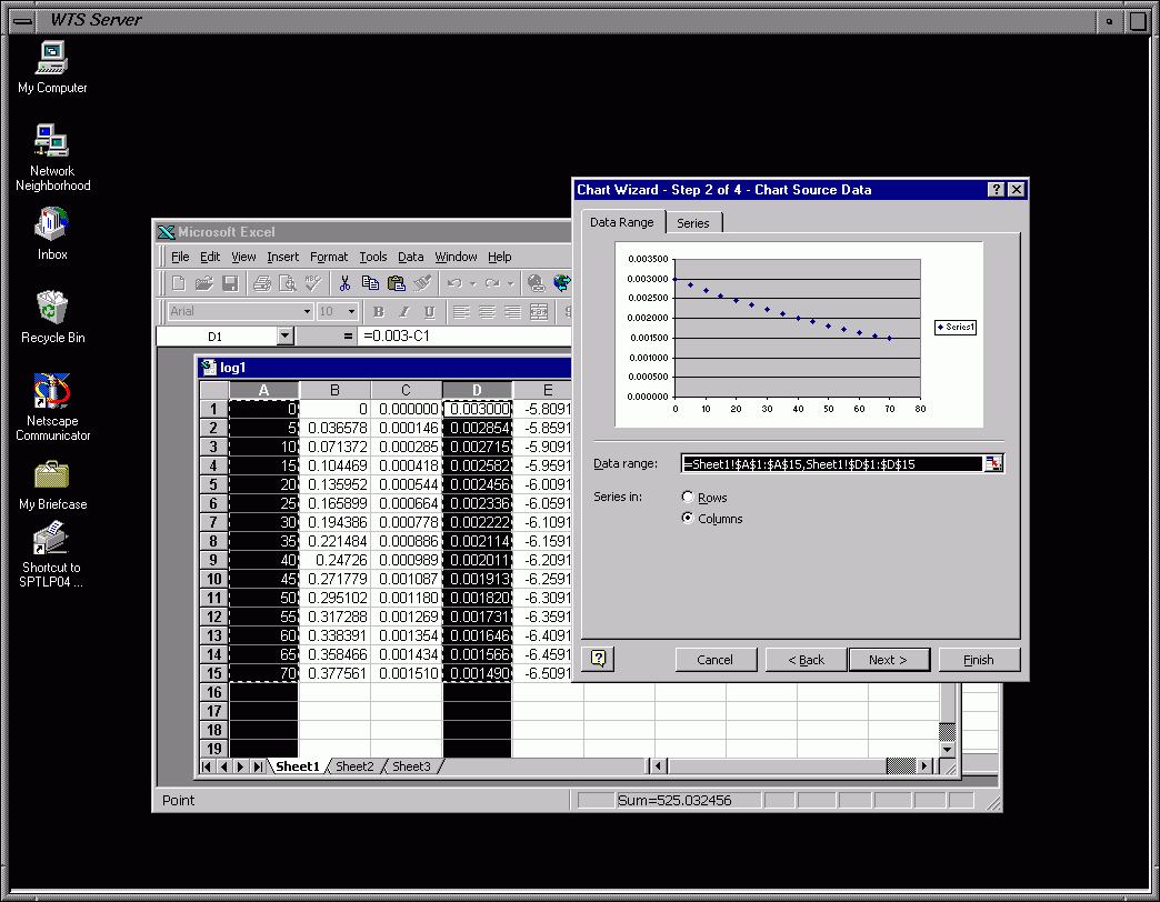
To graph 2 columns highlight the 2 columns.  Since they are adjacent to each
other you can click the left mouse button in the first cell and drag the pointer
(mouse) while holding the button until you've highlighted the data you want to plot.
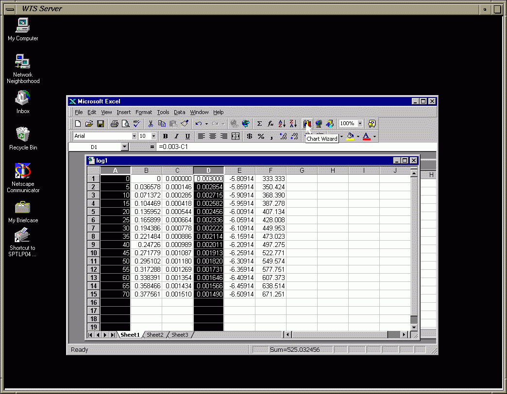
Frame 0a - Input Data
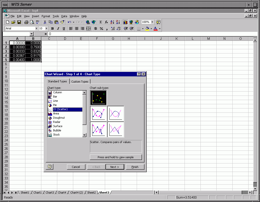
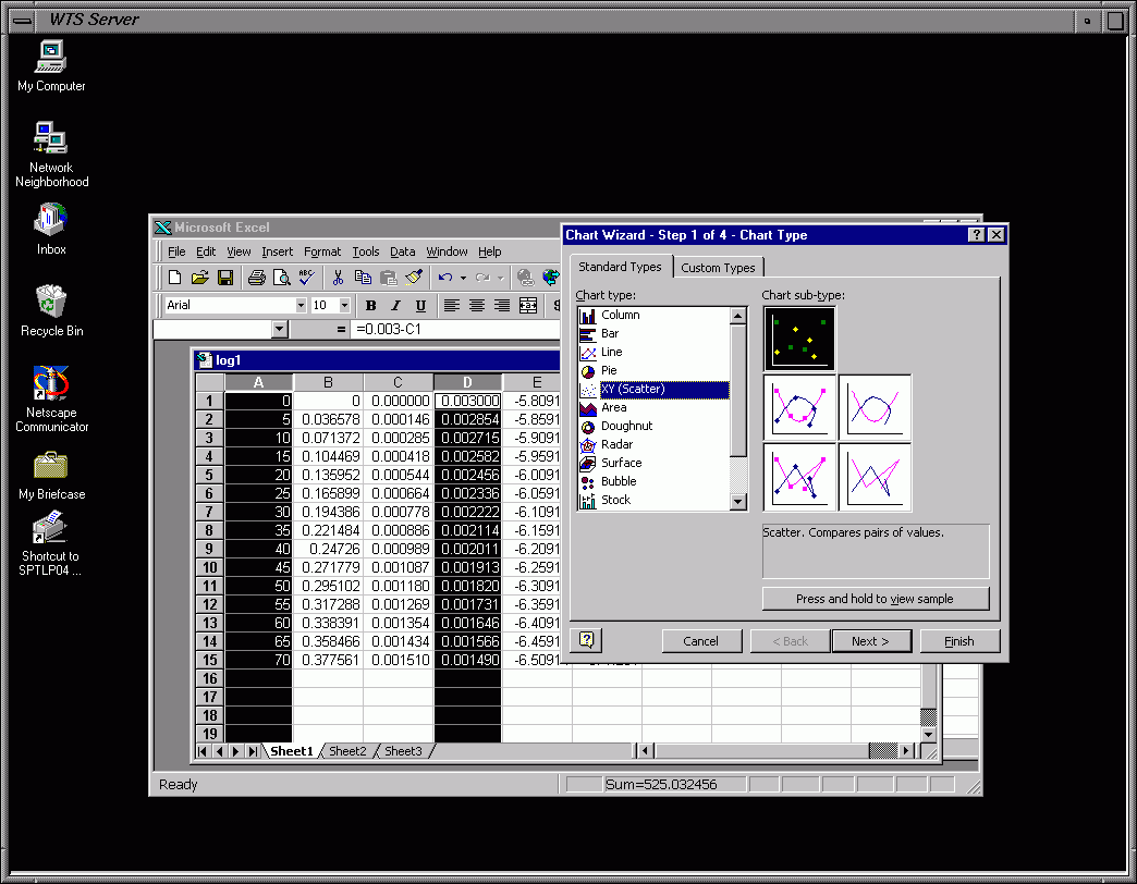
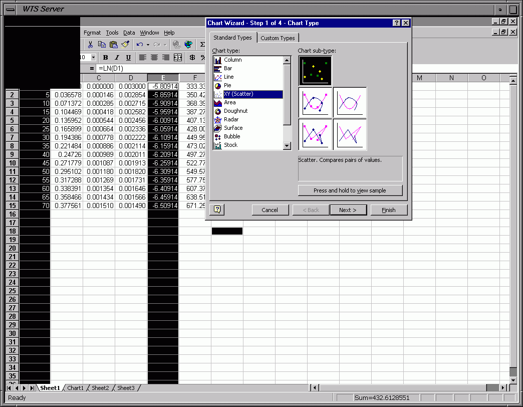
Frame 0b - Chose Scatter Plot (Click on Chart Icon in Menu Bar)
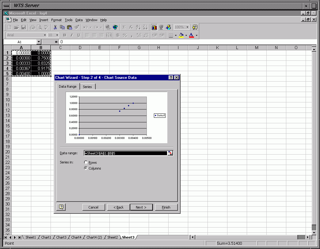
Frame 0c - Plot Highlighted Data
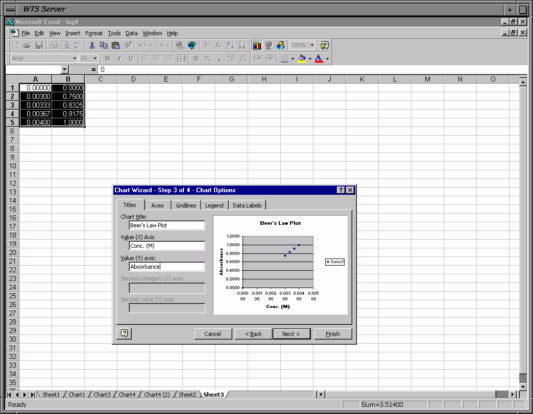
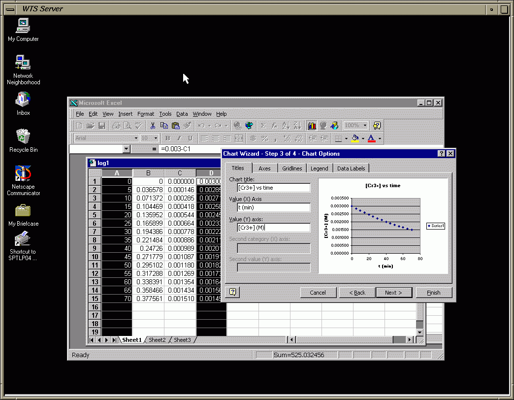
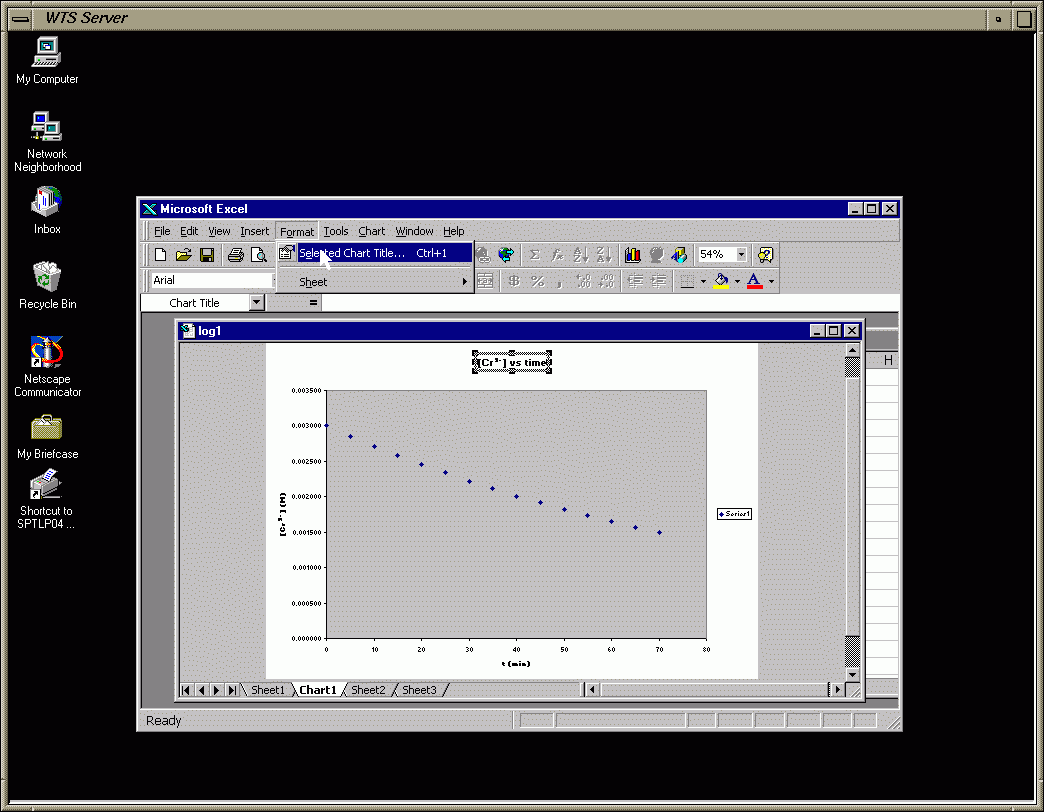
Frame 0d - Chart Options (Titles)
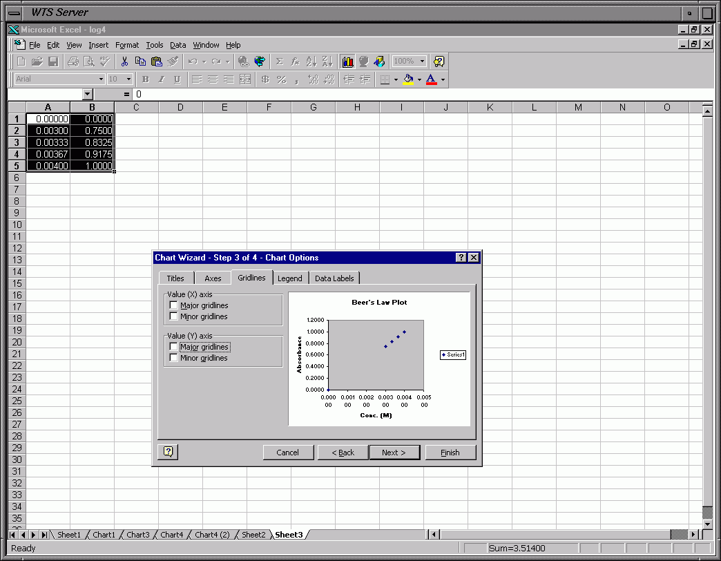
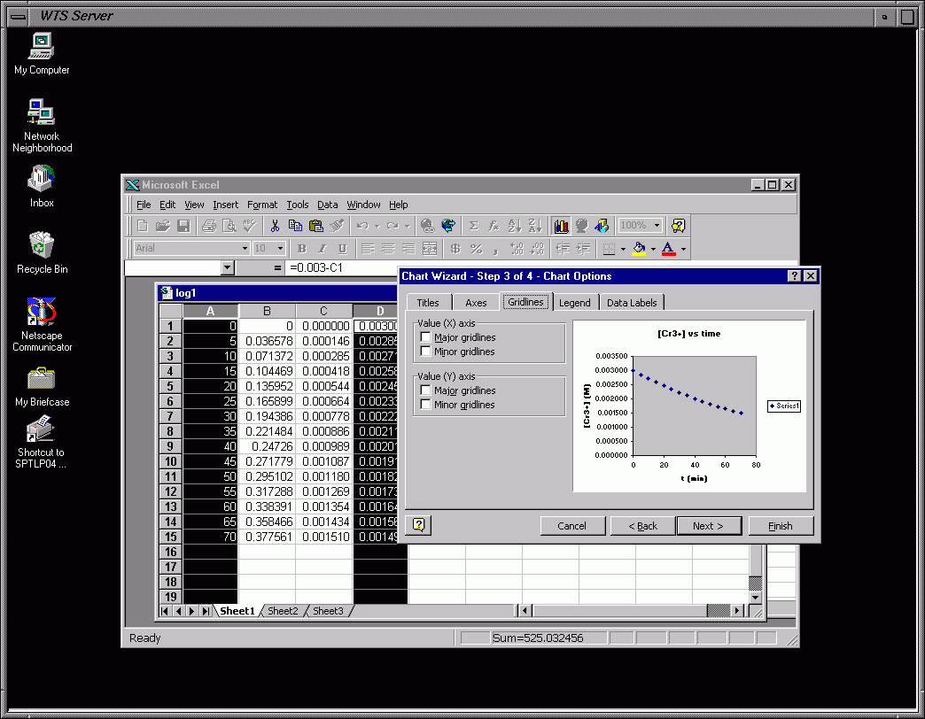
Frame 0e - Chart Options (Remove Grid Lines)
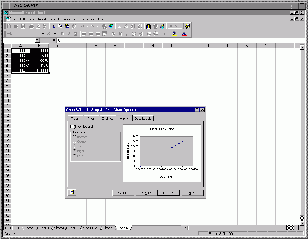
Frame 0f - Chart Options (Remove Legend - Not Needed Since Only One Data Set)
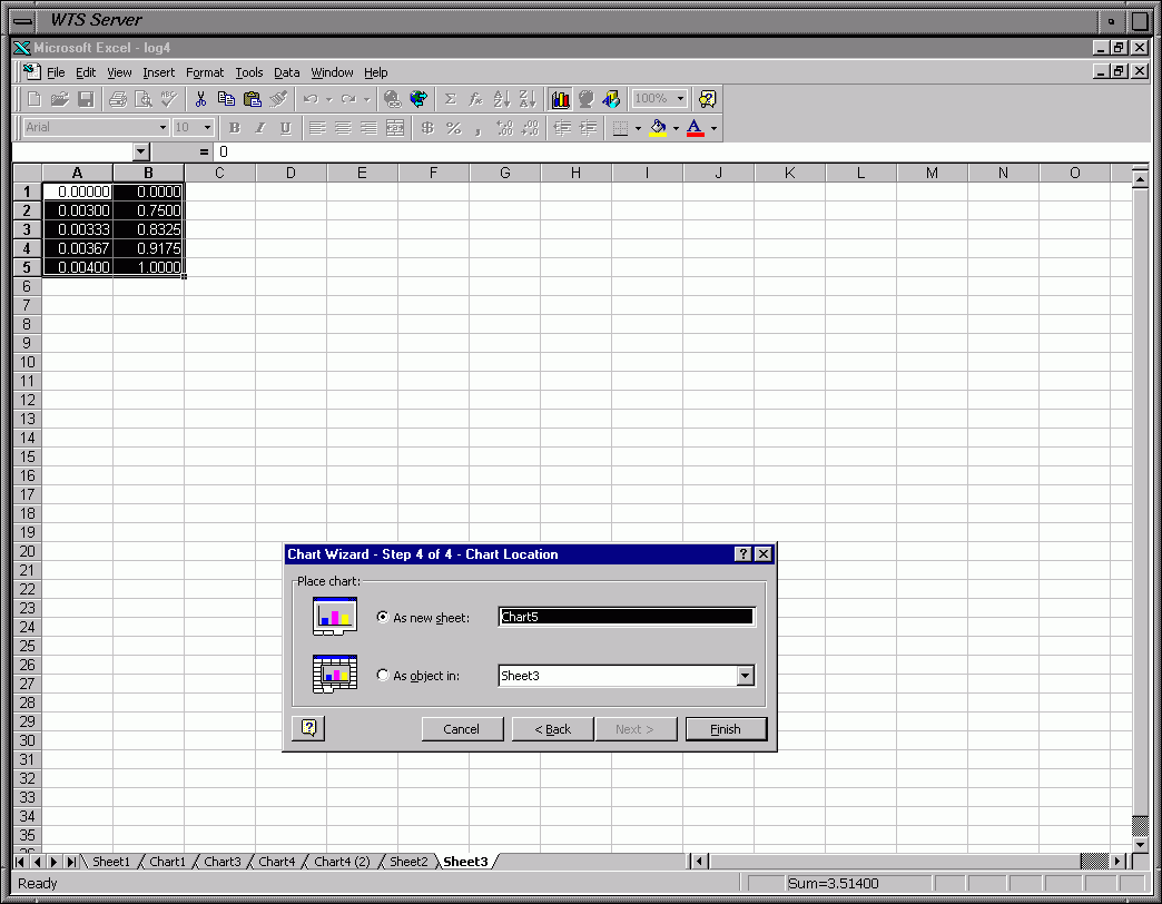
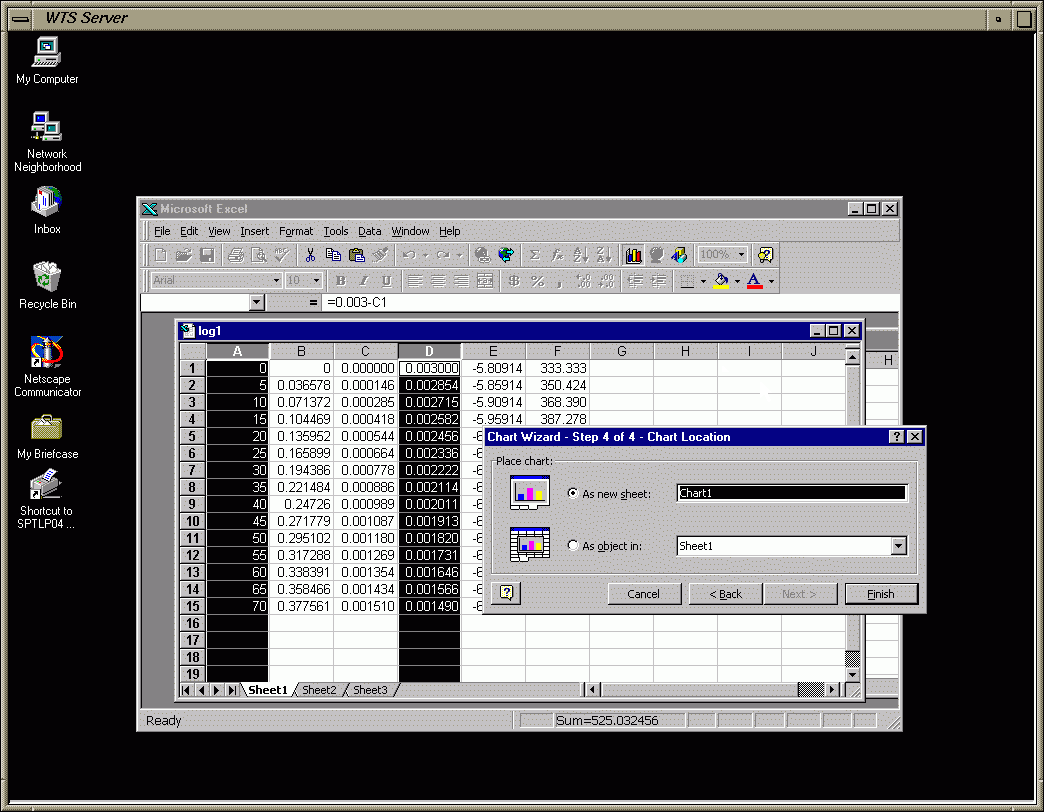
Frame 0g - Make Chart a New Sheet
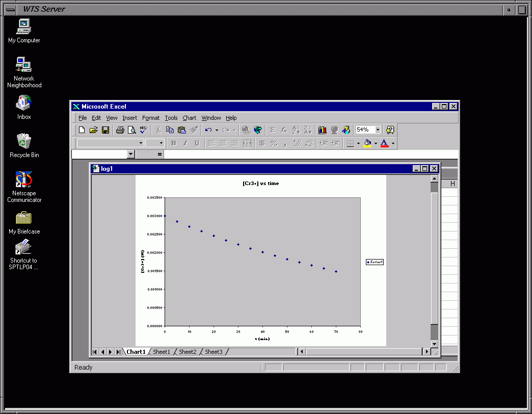
Frame 0h - Go to New Chart
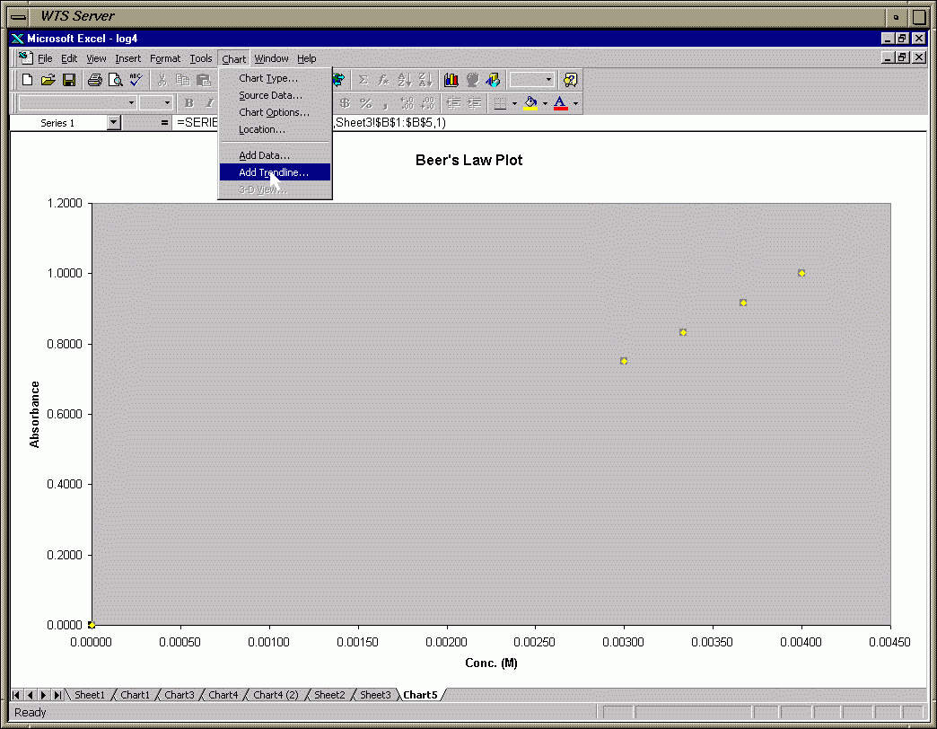
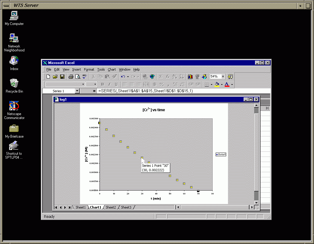
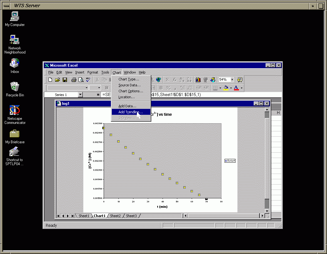
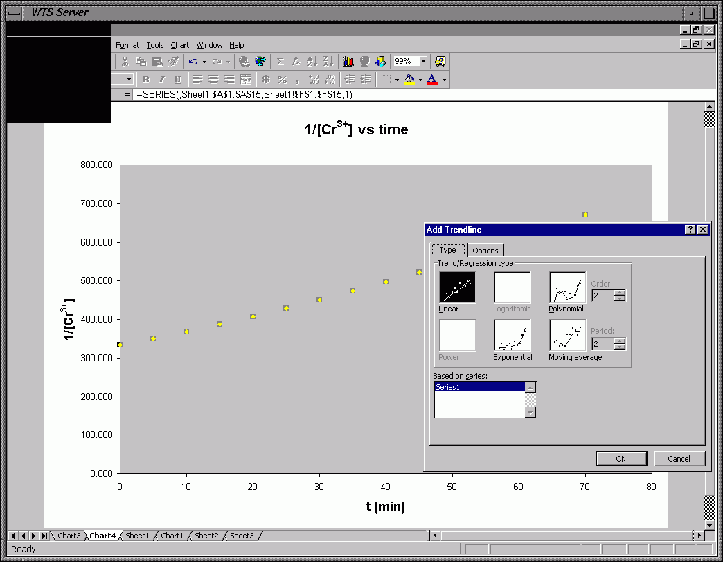
Frame 0i - Click on a Data Point and Go To Chart and Choose Trendline
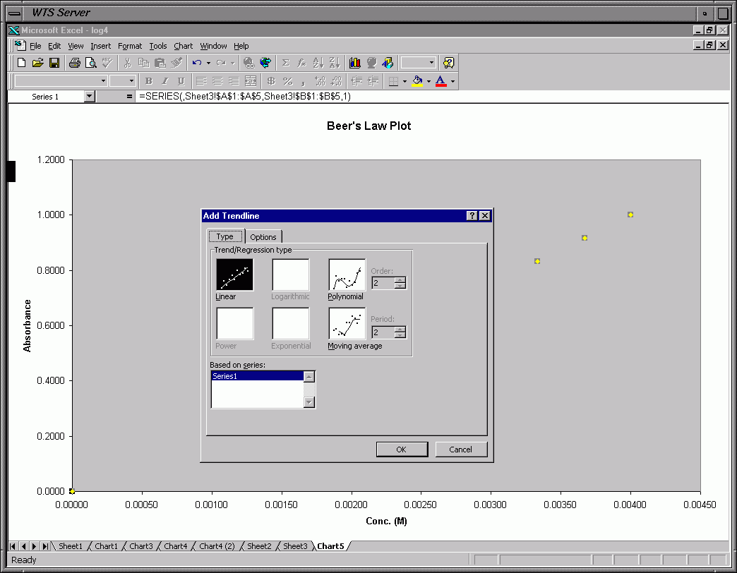
Frame 0j - Choose Linear Regression
Frame 0k - Trendline Options (Check Options Shown at Bottom)
Frame 0l - Equation and R2 now Displayed on Chart
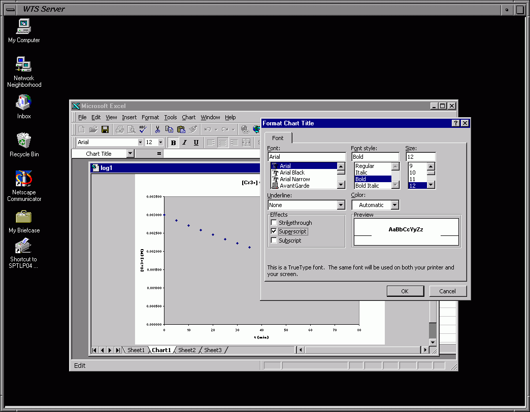
Frame 0m - Change Font for Equation Box
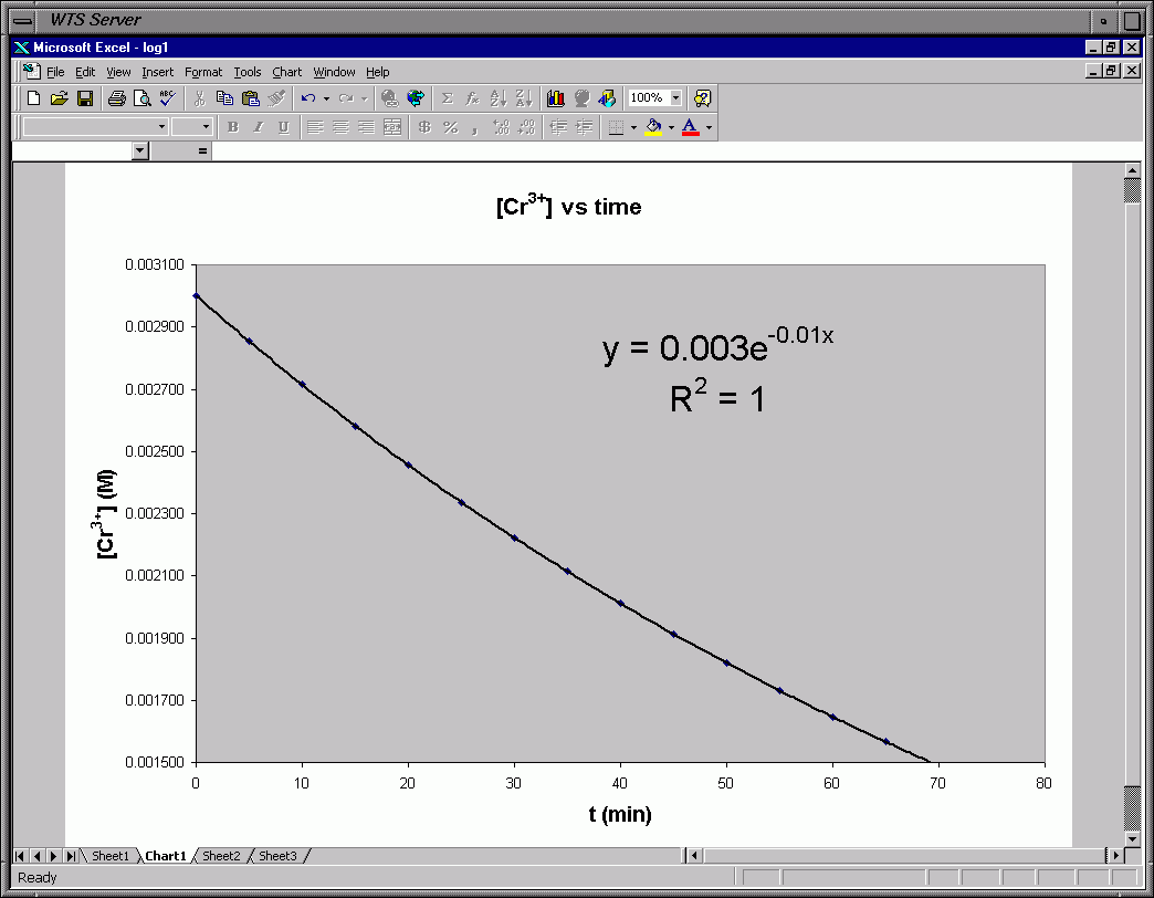
Frame 0n - Finished Graph
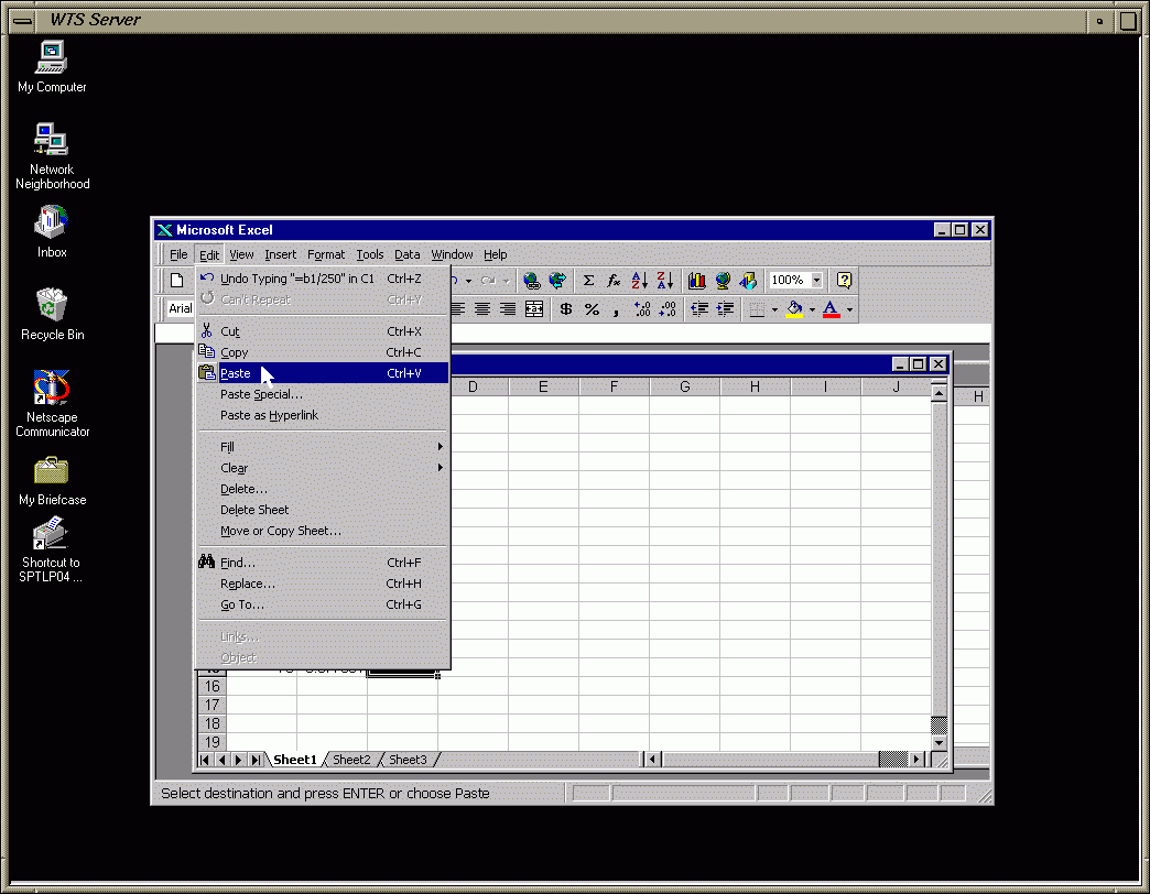
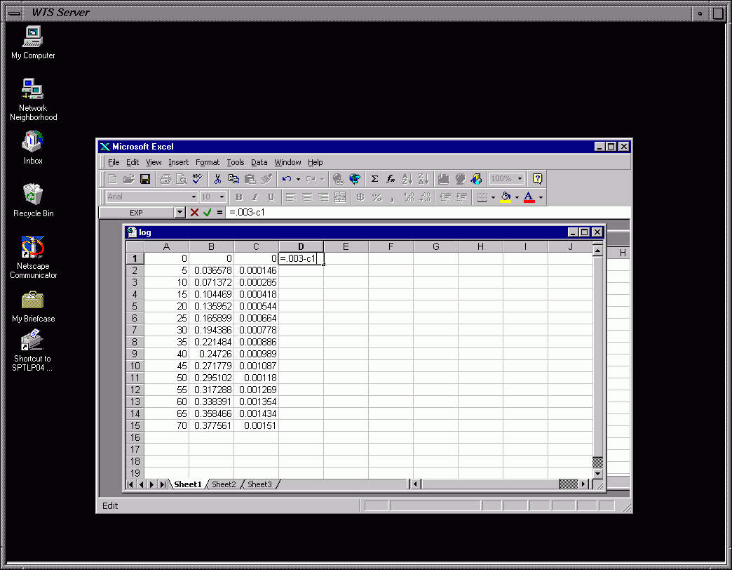
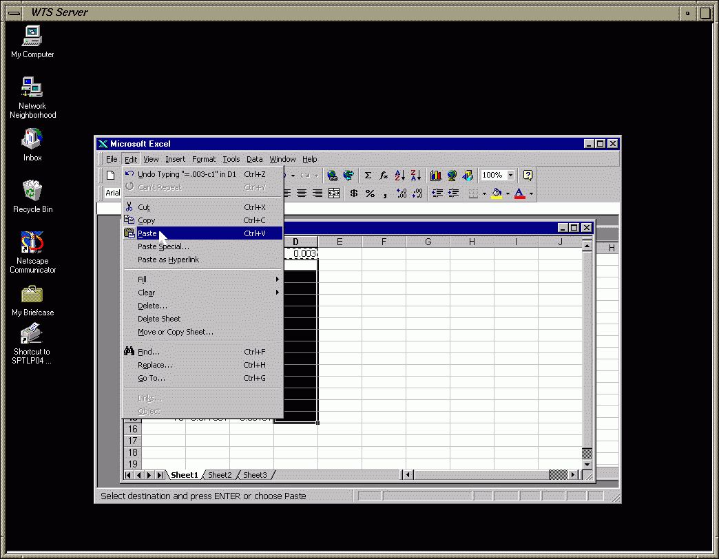
To enter an equation click on the cell (box) and then type
the "equal" (=) key and then your equation.
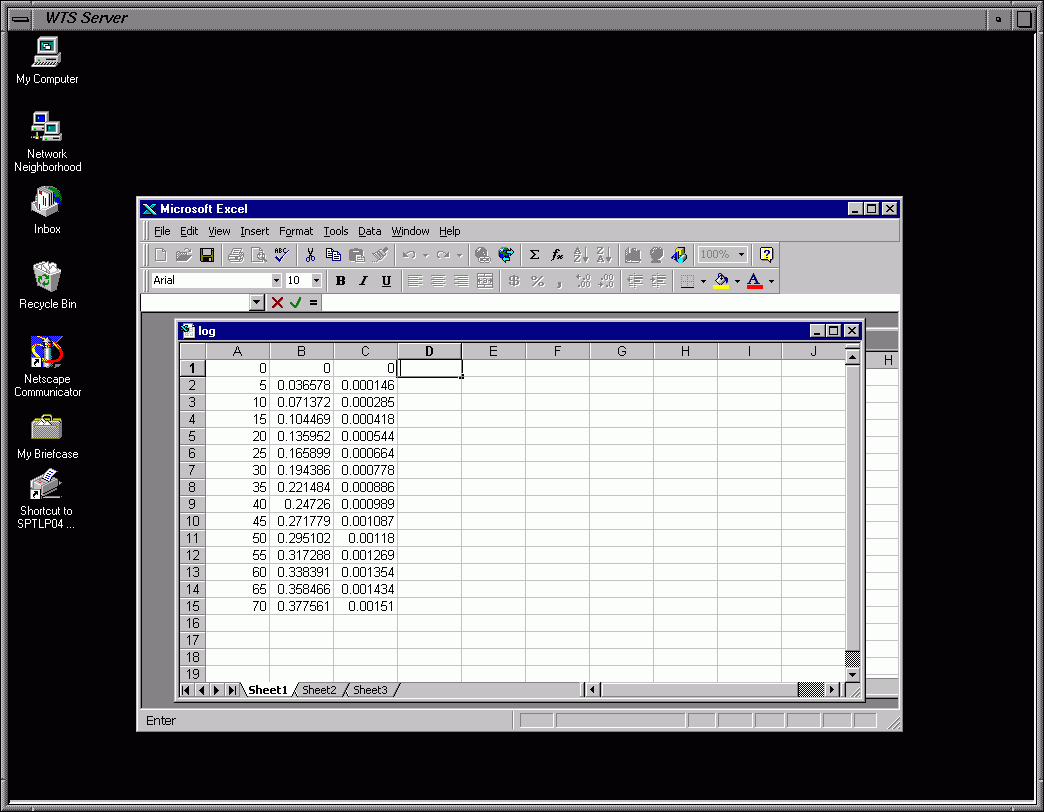
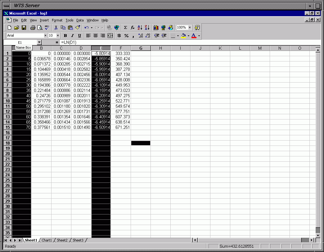
The first set of "slides" is for the first data table for "solution 1".
The columns in the spread sheet are (from left to right):

  time   Abs   [Cr(EDTA)-]t   [Cr3+]t   ln[Cr3+]t   1/[Cr3+]t
IMPORTANT:  The nice thing about using Excel is what you can do
once you have one data table done.  After finishing table 1 for
solution 1 you don't have to enter everything over again.  What
you do is highlight the whole table and then copy it.  Then go to
a new sheet (sheet 2) and paste it.  It should look the same.

Now here comes the neat part.  All you have to do is change the first
two columns, time and absorbance AND the initial concentration of [Cr3+]
in the fourth column (column D).  Edit Cell 1 in column D to change this
concentration and then copy it to the other cells in column D.  As you
change the absorbance you will see ALL the other numbers in the other
columns change automatically and you have the data table for solution 2
in the time it takes you to type in the absorbance values for solution 2
and change the initial concentration in column D.

Then repeat for solutions 3 and 4 and you are done with the data for the
other three solutions in about 10 minutes.  How much simpler can it be?

This will NOT give you new plots.  Sorry, but you will have to do these
over as you do for solution 1.

Don't forget to format your data.
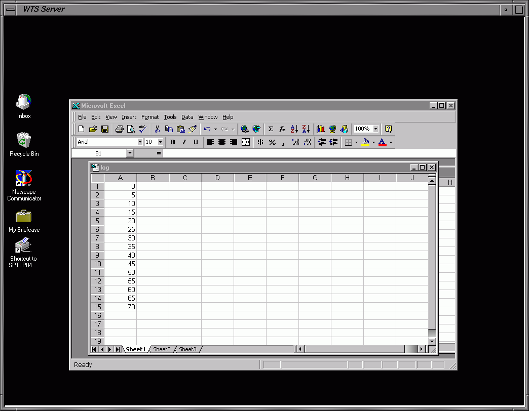
Frame 1 - Input Time Data
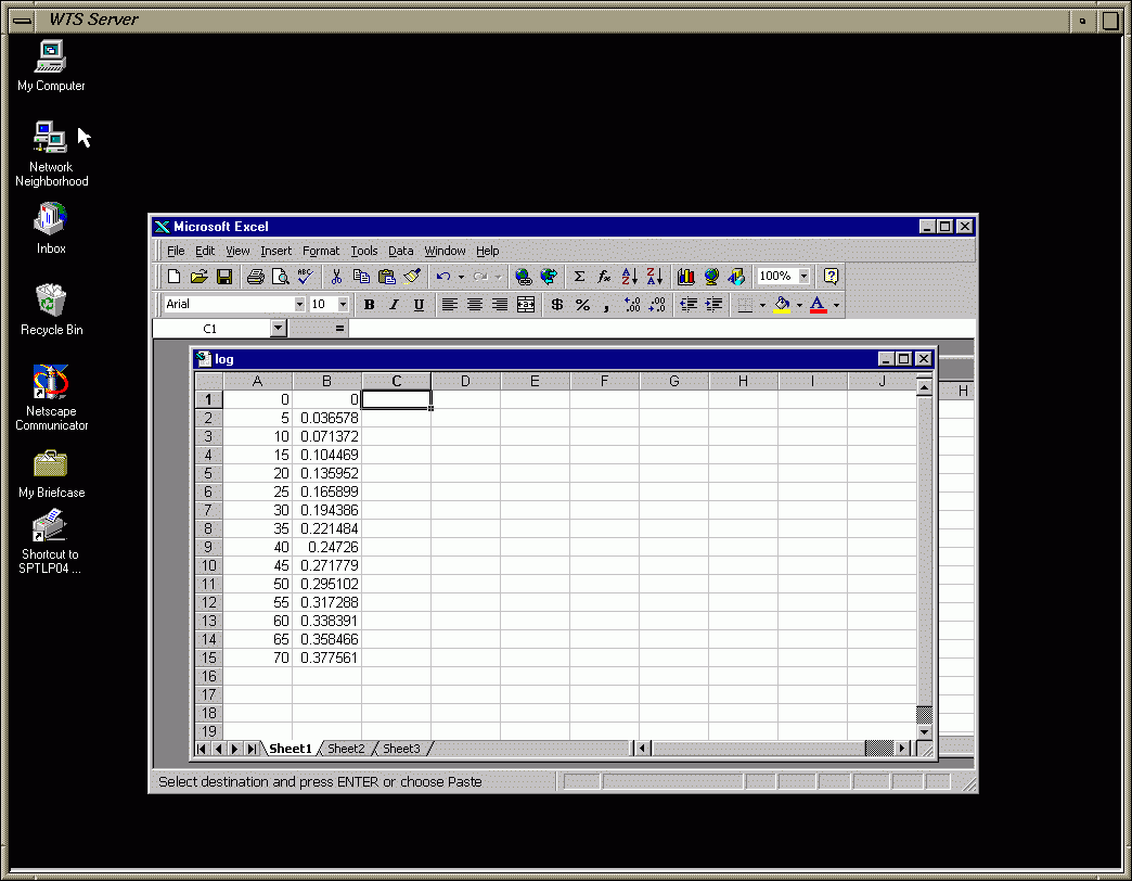
Frame 2 - Input Absorbance Data
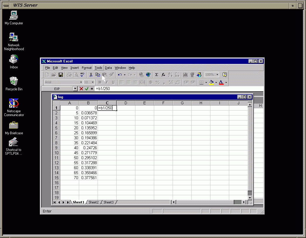
Frame 3 - Input Eqn. to Calc. [Cr(EDTA)-]t from Abs. and Beer's Law Slope
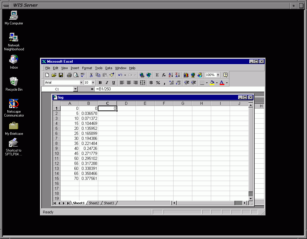
Frame 4 - Result for Cell C1: [Cr(EDTA)-]t for Zero Abs.
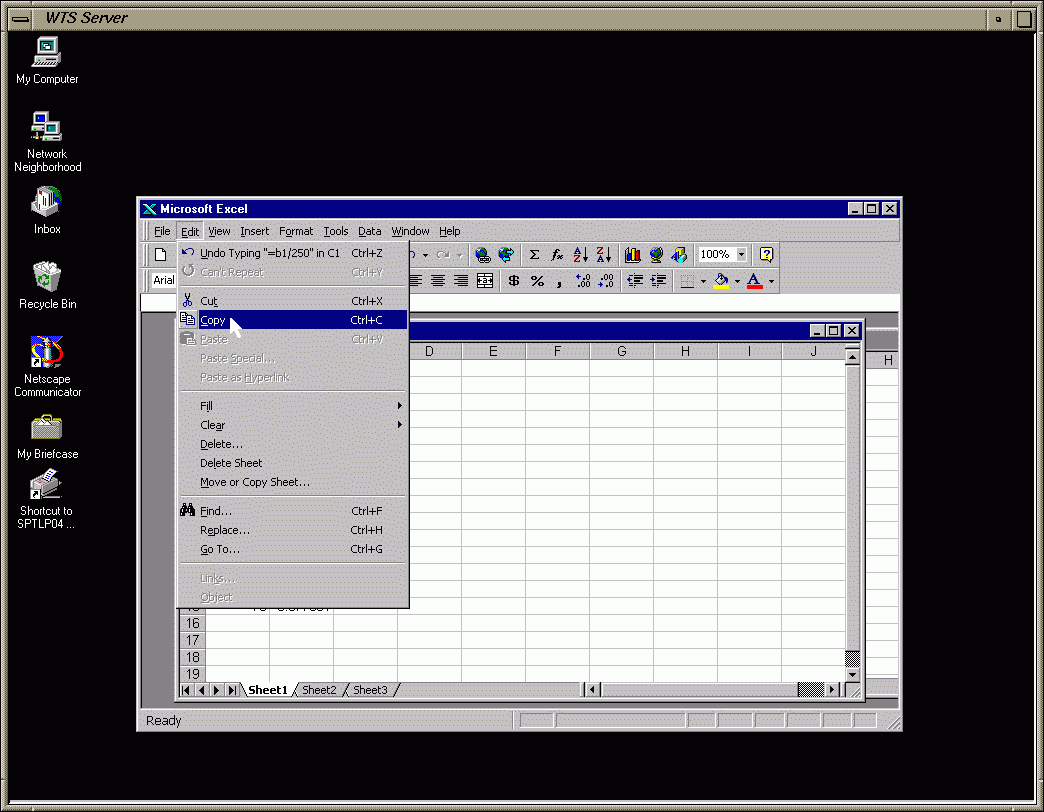
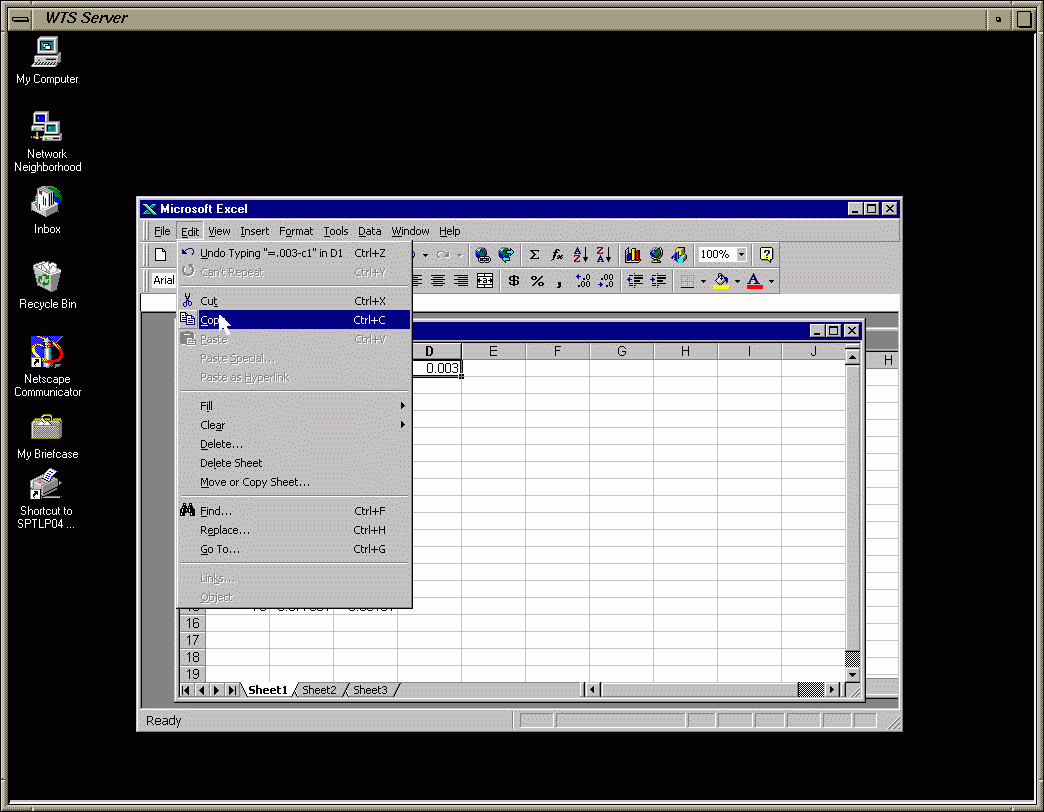
Frame 5 - Copy Cell C1 (Copies the Eqn.)
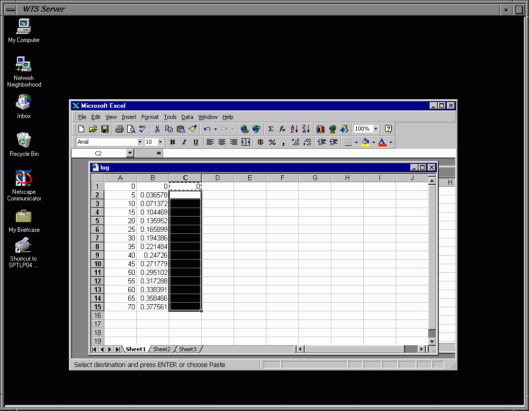
Frame 6 - Highlight Remaining Cells in Column C
Frame 7 - Paste Cell C1 Contents (Eqn.) to Remaining Cells
Frame 8 - Results of Paste: [Cr(EDTA)-]t for each Abs. Automatically Calc.
Frame 9 - Input Eqn. to Calc. [Cr3+]t Using [Cr3+]0 (0.003 M) & [Cr(EDTA)-]t from Column C
Frame 10 - Copy Cell D1 (Copies the Eqn.)
Frame 11 - Paste Cell D1 Contents (Eqn.) to Remaining Cells of Column D
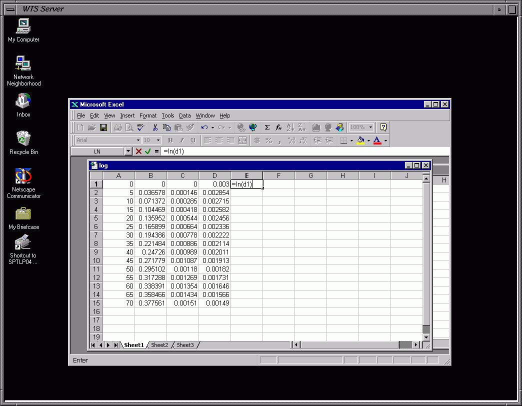
Frame 12 - Input Eqn. to Calc. ln[Cr3+]t for Time Zero Using [Cr3+]t from Cell D1
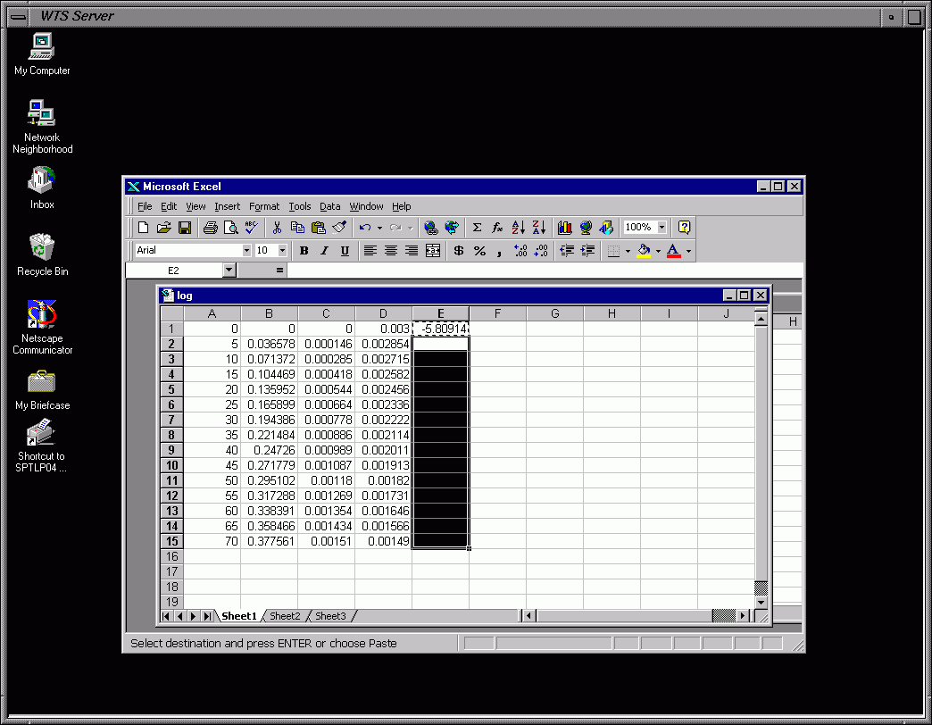
Frame 13 - Copy & Paste Cell E1 (Copies the Eqn.) to Remaining Cells of Column E
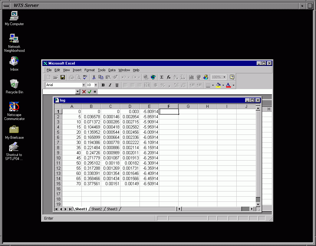
Frame 14 - Results of Paste: Calc. of ln[Cr3+]t for each Time Step
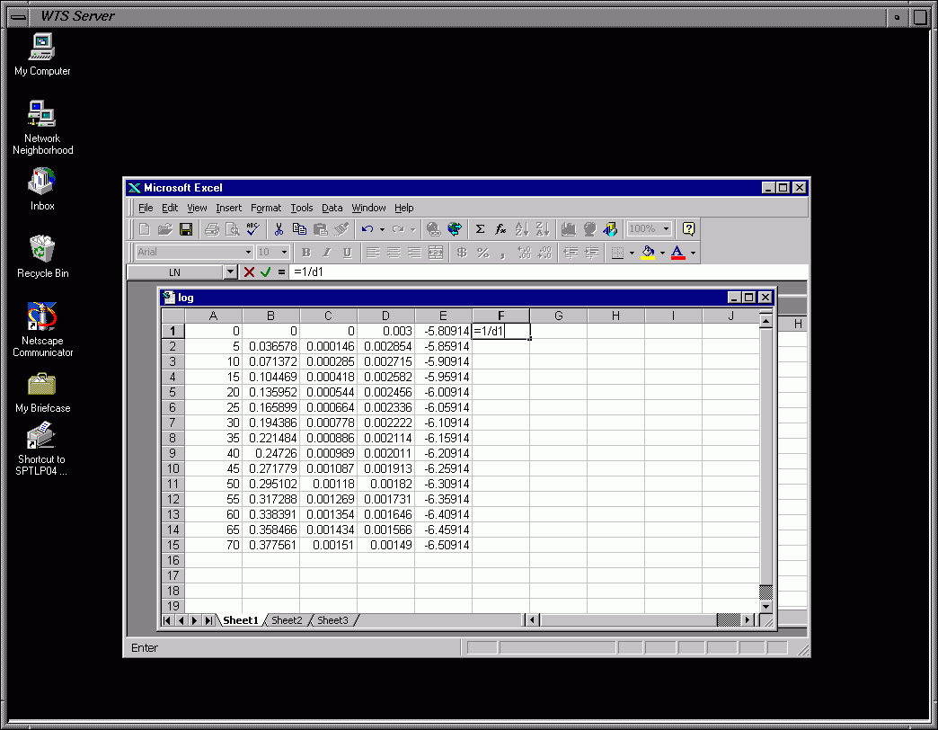
Frame 15 - Input Eqn. to Calc. 1/[Cr3+]t for Time Zero Using [Cr3+]t from Cell D1
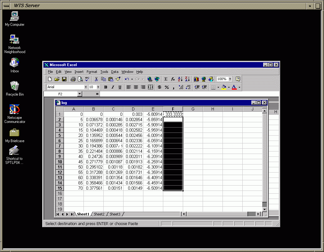
Frame 16 - Copy & Paste Cell F1 (Copies the Eqn.) to Remaining Cells of Column F
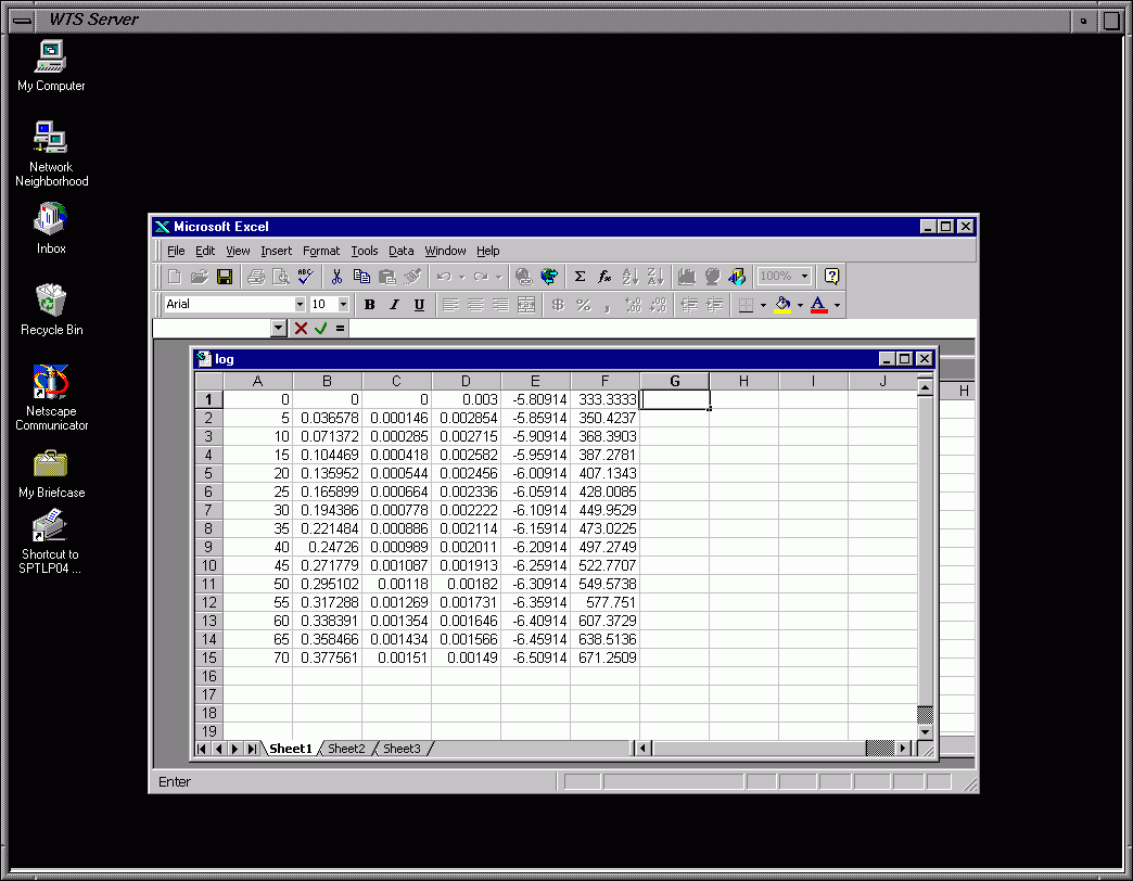
Frame 17 - Results of Paste: Calc. of 1/[Cr3+]t for each Time Step
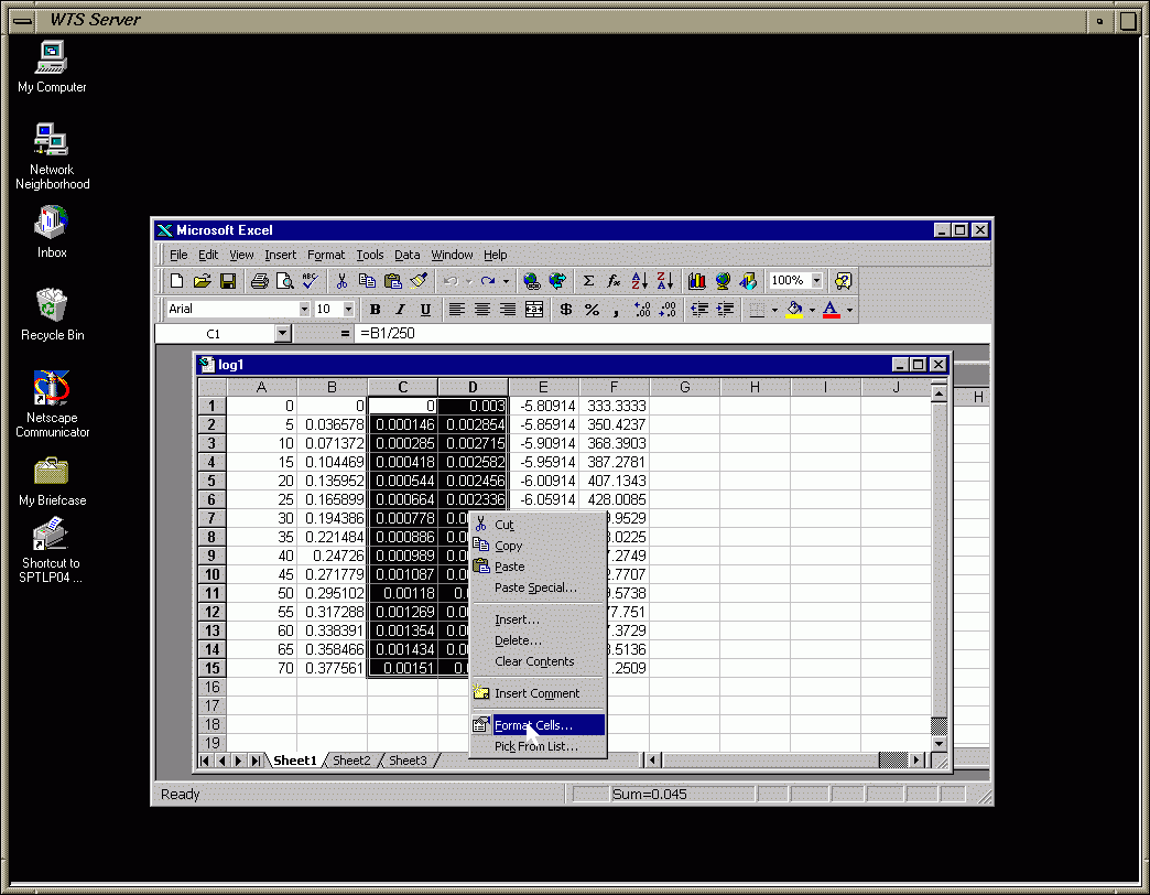
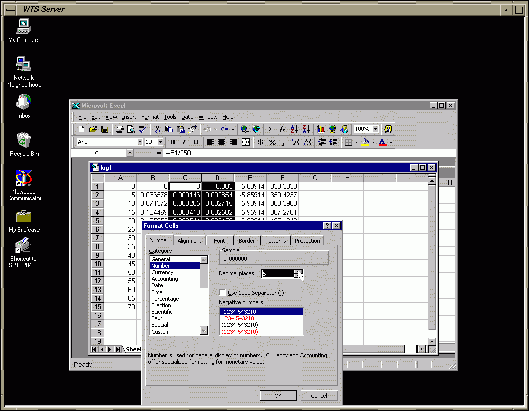
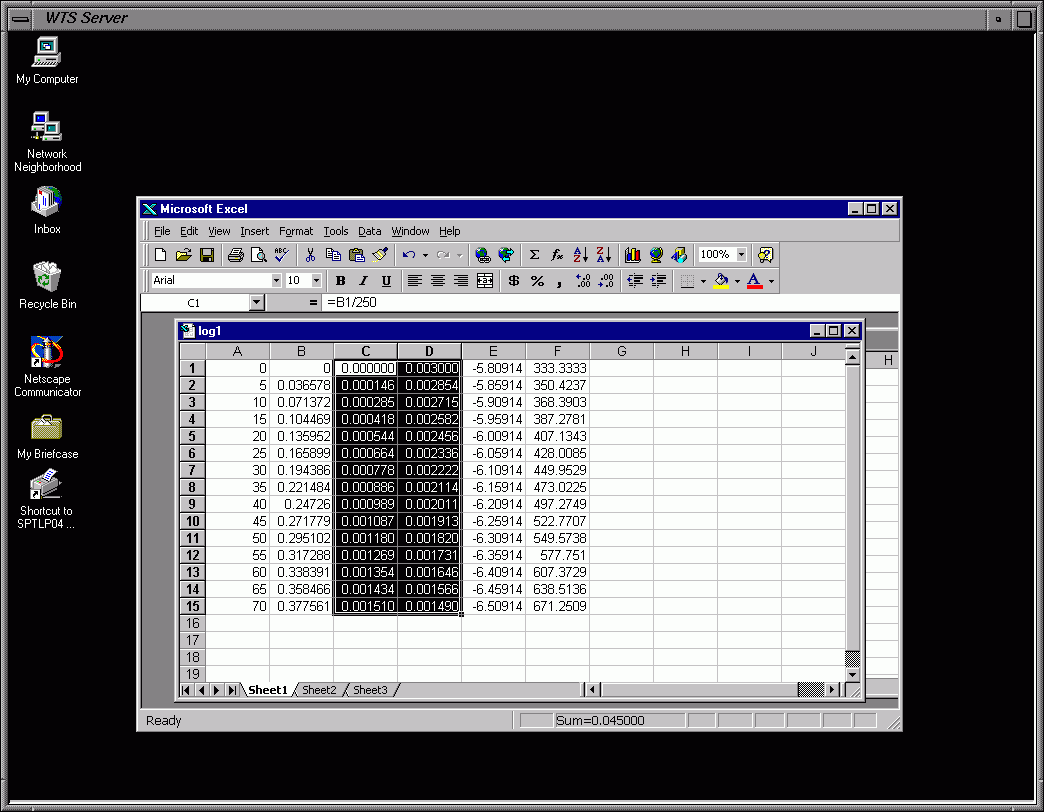
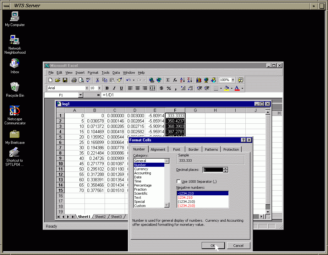
Frame 18 - Format Data to Show a Certain Number of Decimal Places (you decide how many)
Frame 19 - Format Data (cont.)
Frame 20 - Format Data (cont.)
Frame 21 - Format Data (cont.)
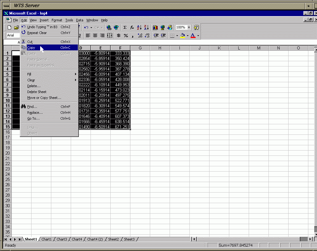
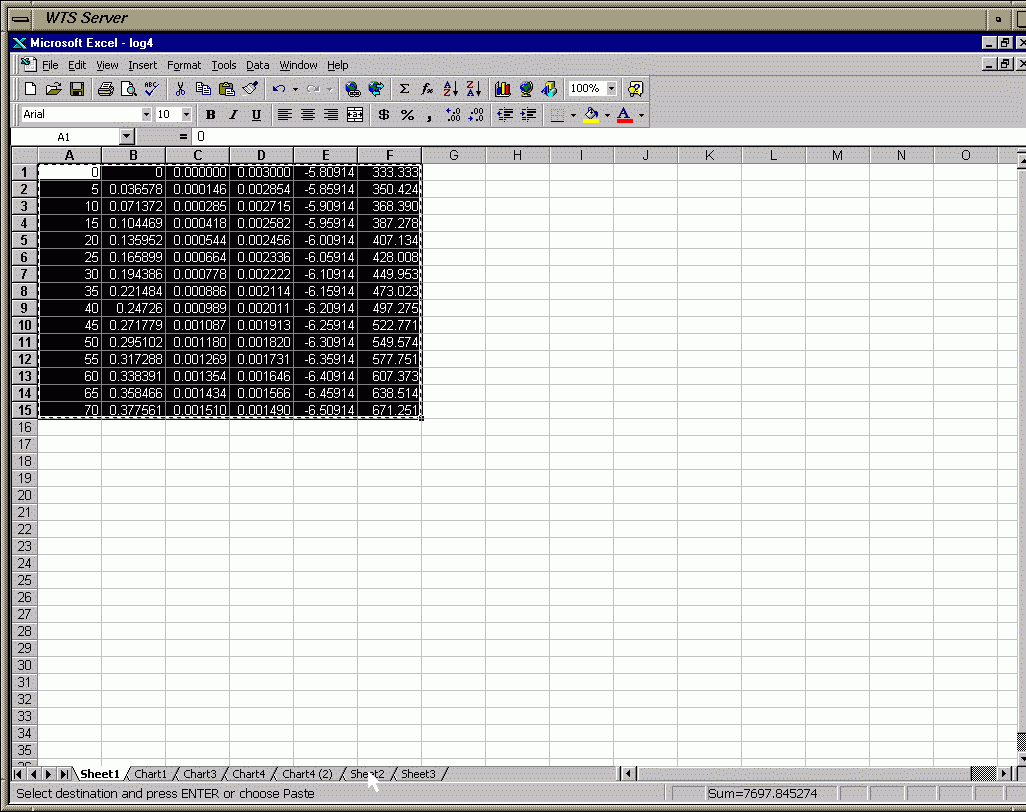
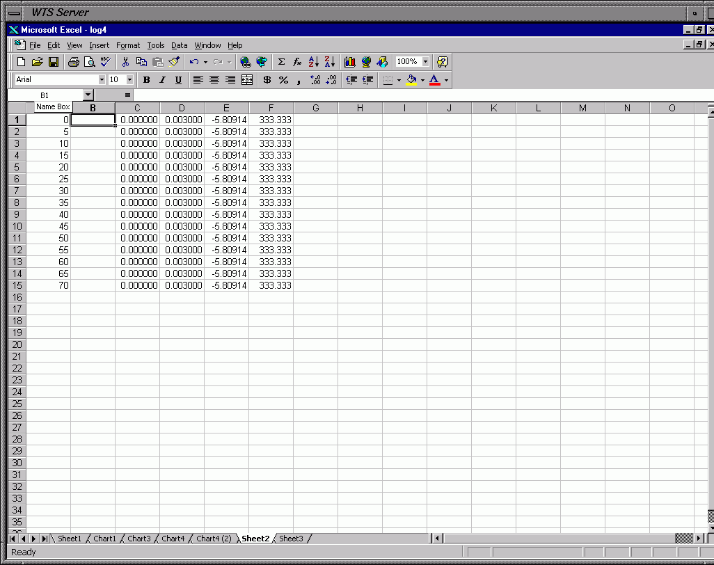
Frame 21a - Highlight All of Table 1 in Sheet 1
Frame 21b - Copy Table 1
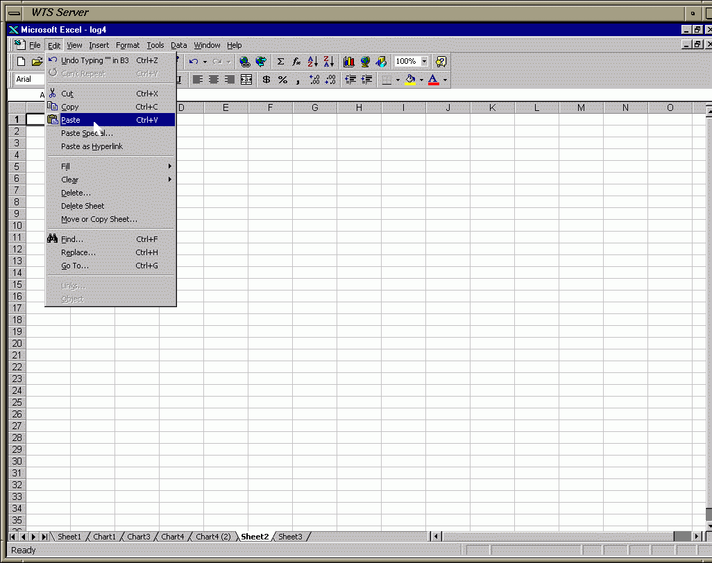
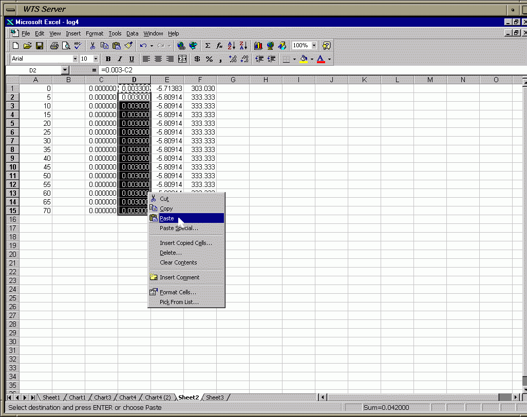
Frame 21c - Go to Sheet 2 & Highlight Cell A1 & Click on Paste
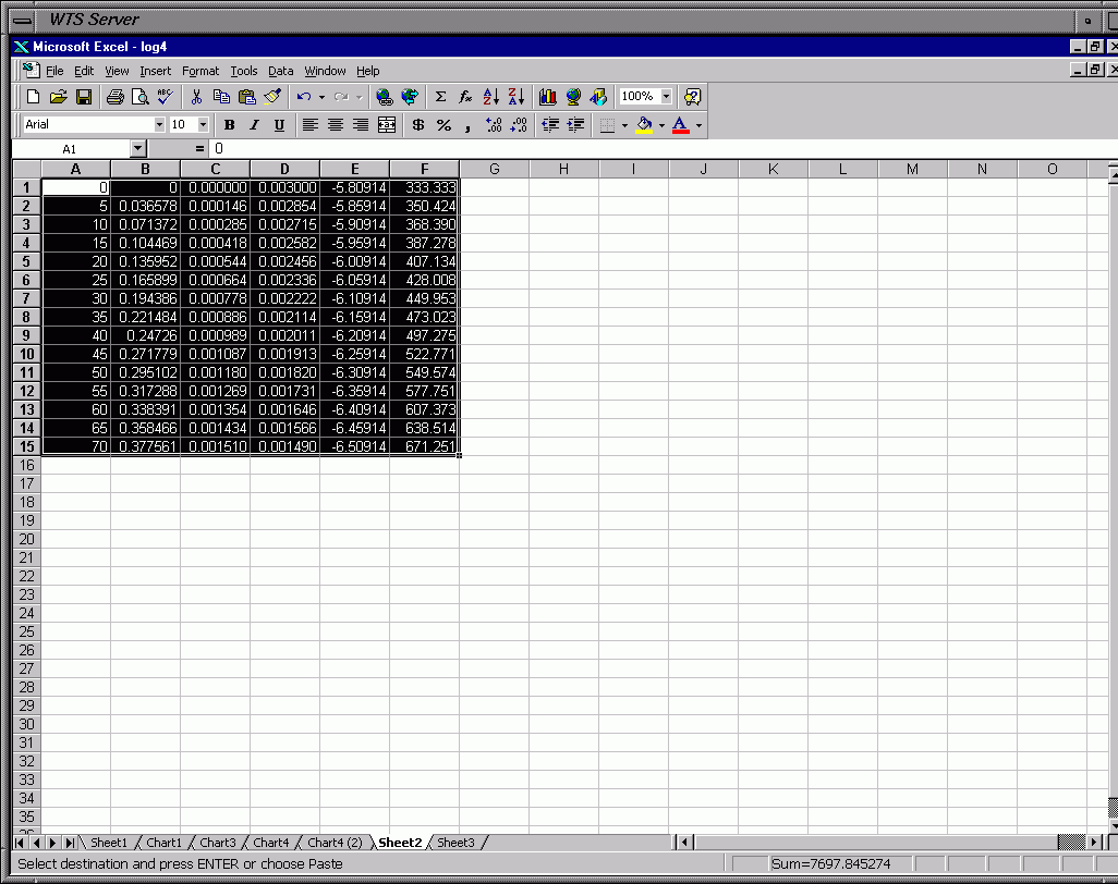
Frame 21d - Paste Contents of Table 1
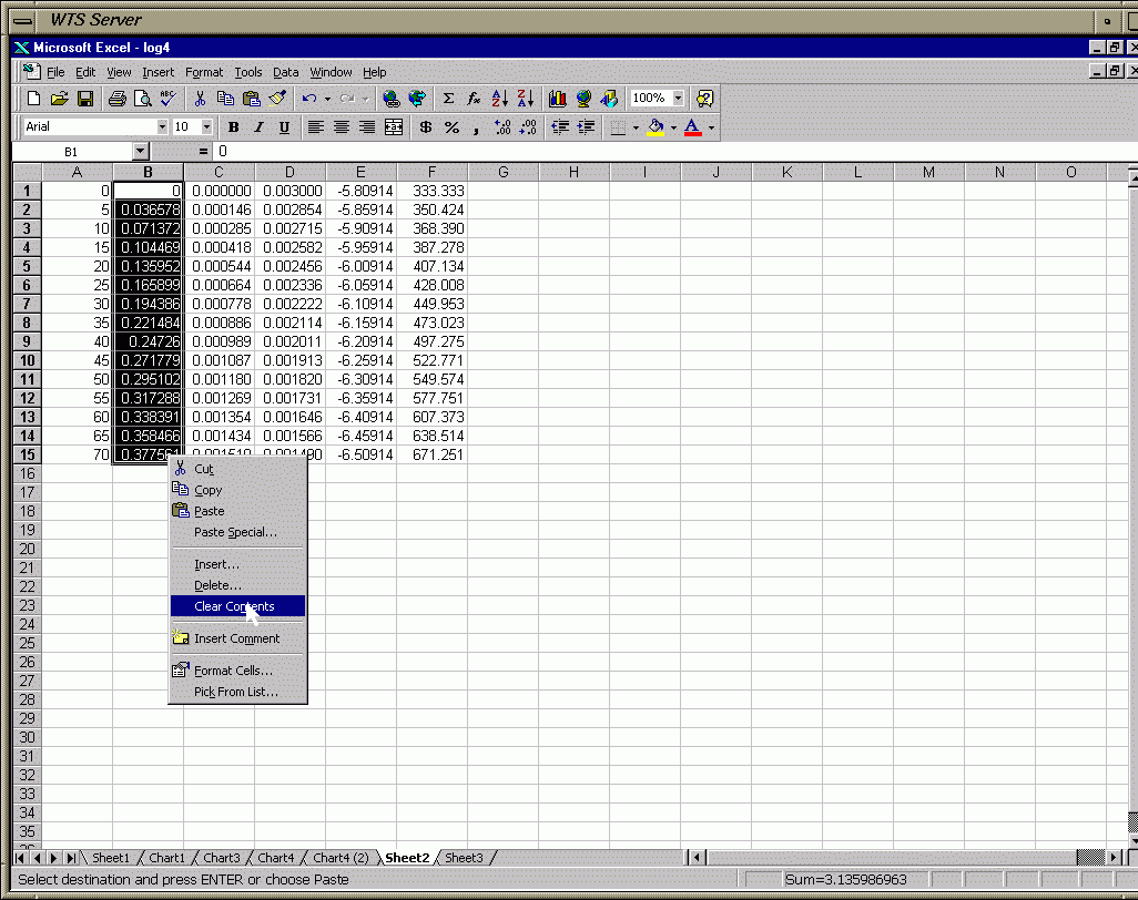
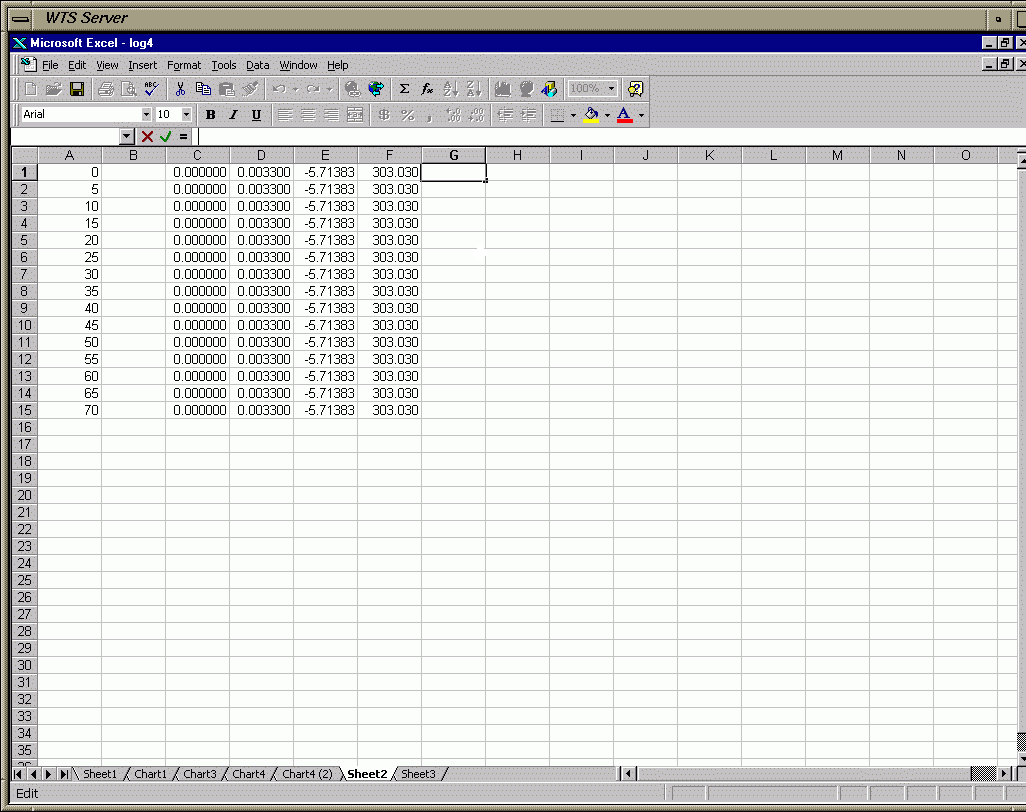
Frame 21e - Clear Contents of Absorbance Column (Time Column Too if That is Diff. than Soln. 1)
Frame 21f - Result of Clear Contents (Note this Clears Column Containing [Cr(EDTA)-]t for Soln. 2)
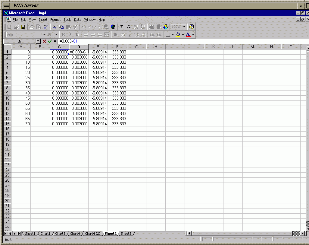
Frame 21g - Highlight Cell D1 (Edit Eqn. to Calc. [Cr3+]t)
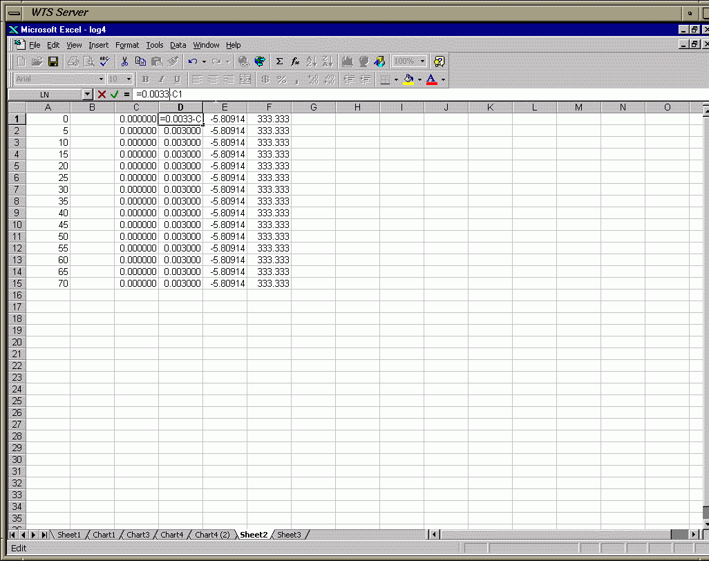
Frame 21h - Change [Cr3+]0 to Value for Soln. 2 (0.0033M)
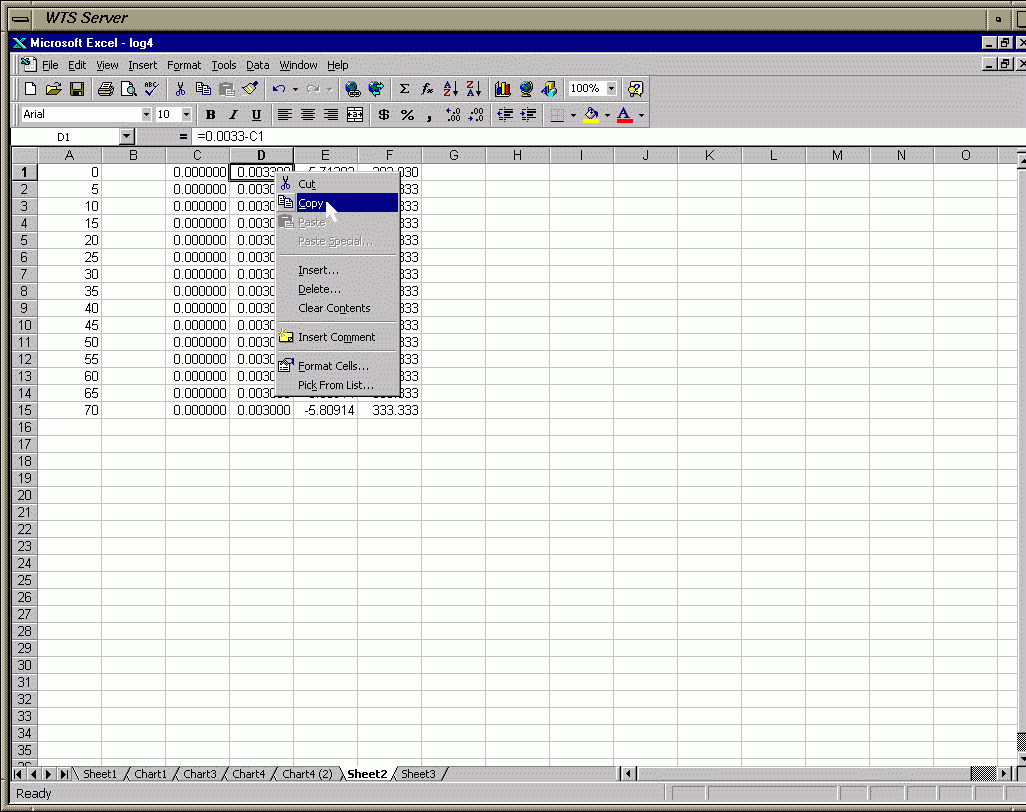
Frame 21i - Copy Cell D1 (Copies Eqn. for [Cr3+]t for Soln. 2)
Frame 21j - Paste Eqn. from D1 to Remaining Cells of Column D
Frame 21k - Result of Paste
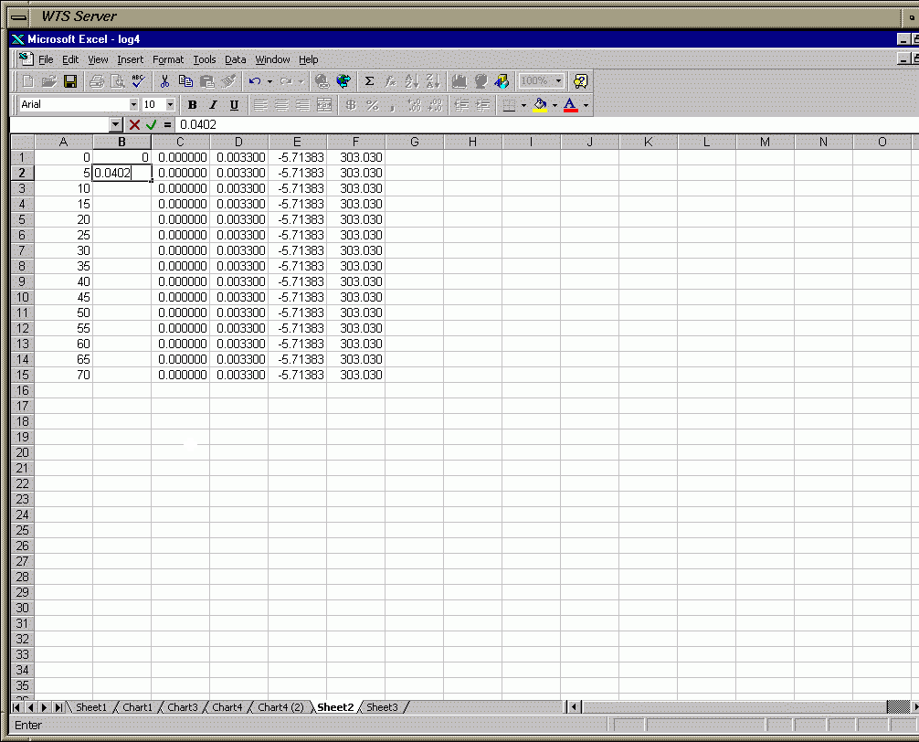
Frame 21l - Enter Absorbance Values for Soln. 2
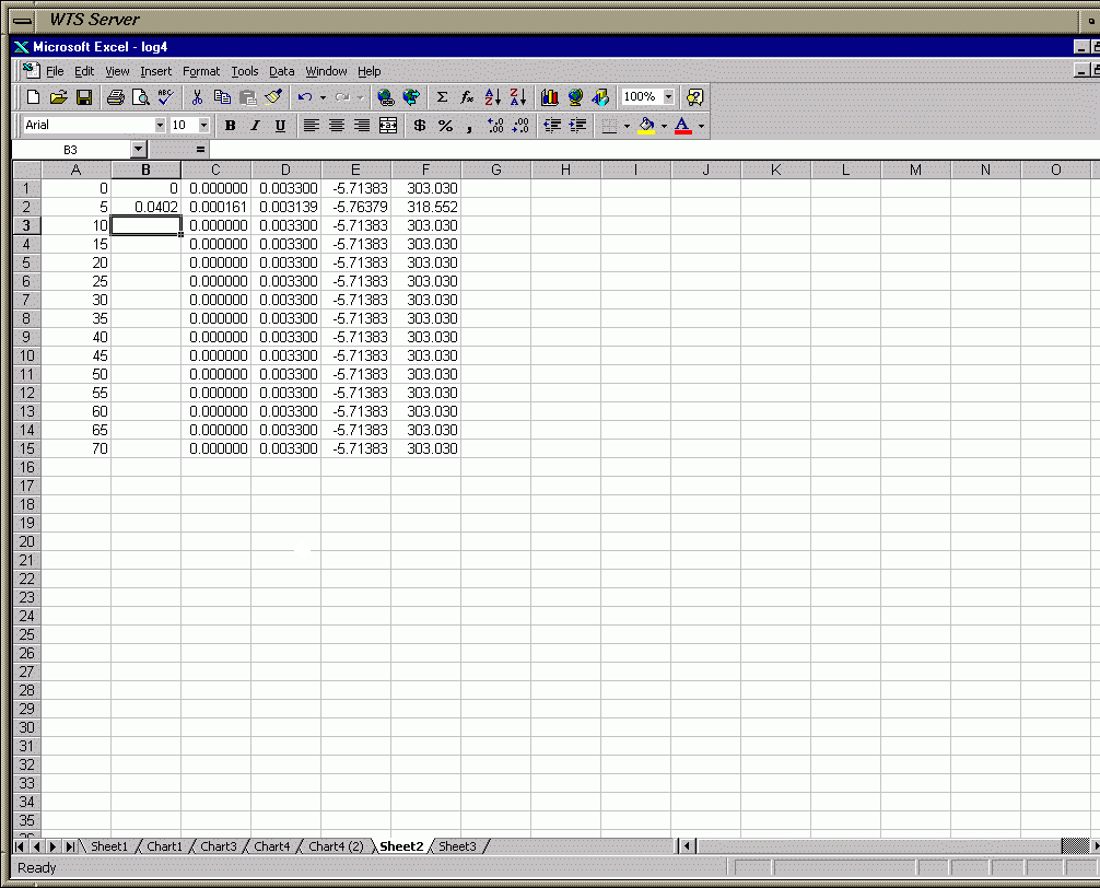
Frame 21m - Result (Automatically Calc. the New Values for Soln 2; Repeat for Remaining Abs. Values)
For graph 2 you plot [Cr3+]t vs. time for all 4 solutions on the same graph.  You
are suppose to draw best-fit curved lines.  Do NOT draw jagged lines (i.e. the
kind you see for the stock market where a straight line is drawn from one point to
the next).  In my example I knew ahead of time that my data was first order so I
used an exponential fit.  You could try that or some sort of polynomial fit
(such as x2 or x3), although exponential generally works
well.  I only plotted solution 1.  You need to plot the other 3
solutions in a similar manner.  Since I had only one set of data plotted I removed
the legend.  Since you will have 4 different lines you will want to keep the legend
(you can't tell the players apart without a scorecard).  Change the legend for each
data set to something meaningful (like "Soln 1", "Soln 2", etc.).   Also, you will
not want to make the equation and R2 as large as I did.  You will need to do this
for each line plotted and move them as close as possible to the proper line.
You can even make the legend horizontal, move it into the graph area above the lines
and put the equation for each line under the title for each line.
To graph 2 columns which are not adjacent to each other you need to click on the first
column and then while holding the "control key" click and highlight the the second column.
Frame 22 - Highlight Data to Plot
Frame 23 - Click on Chart Icon in Menu Bar (Chose Scatter Plot)
Frame 24 - Plot Data
Frame 25 - Chart Options (Titles)
Frame 26 - Chart Options (Remove Grid Lines)
Frame 27 - Make Chart a New Sheet
Frame 28 - Go to New Chart (click on tab at bottom)
Frame 29 - Modify Chart Title (highlight 3+)
Frame 30 - Modify Chart Title (make 3+ a superscript)
Frame 31 - Modify Chart Title (select title to change attributes)
Frame 32 - Modify Chart Title (change font size and bold)
Frame 33 - Result of Chart Title Changes
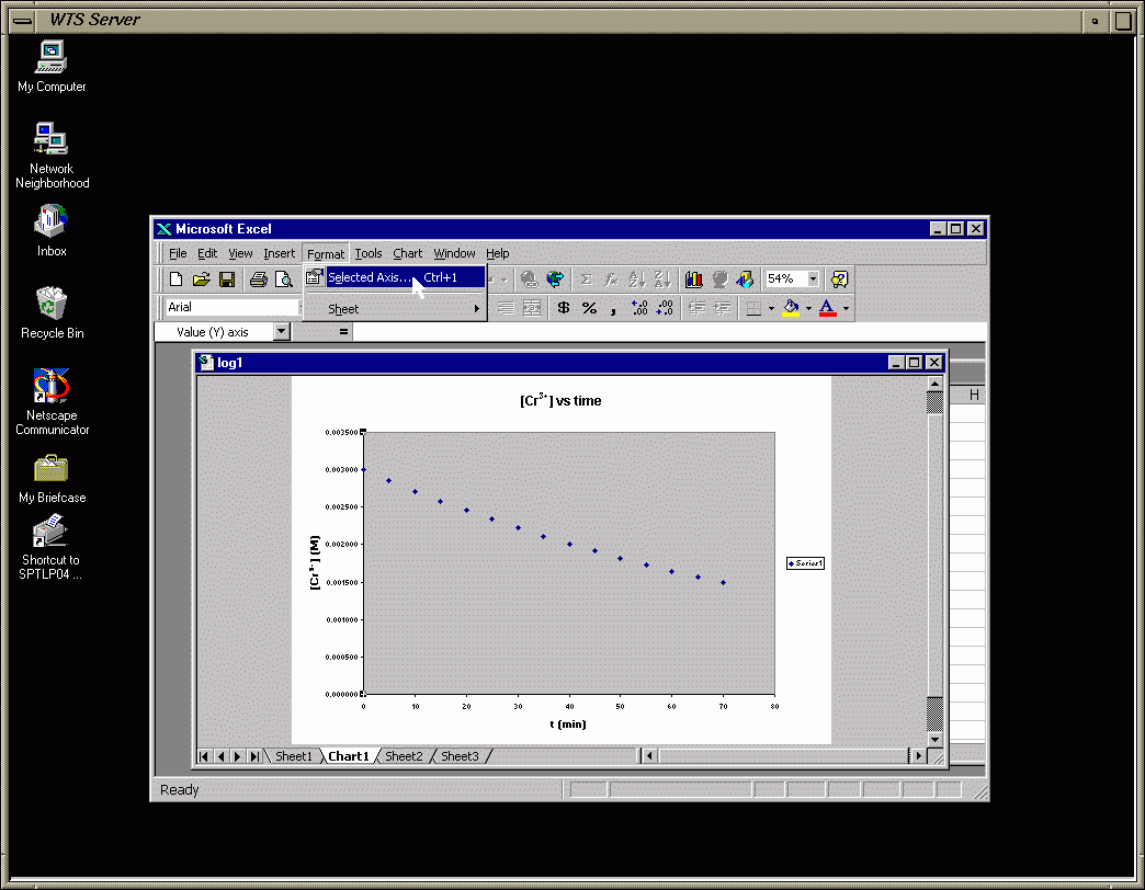
Frame 34 - Modify Y-axis (select axis by clicking on it)
Frame 35 - Change Y-axis Scale (so plot takes up most of the plot area)
Frame 36 - Result of Y-axis Changes
Frame 37 - Click on Data Point (start of trendline procedure)
Frame 38 - Go To Chart and Choose Trendline
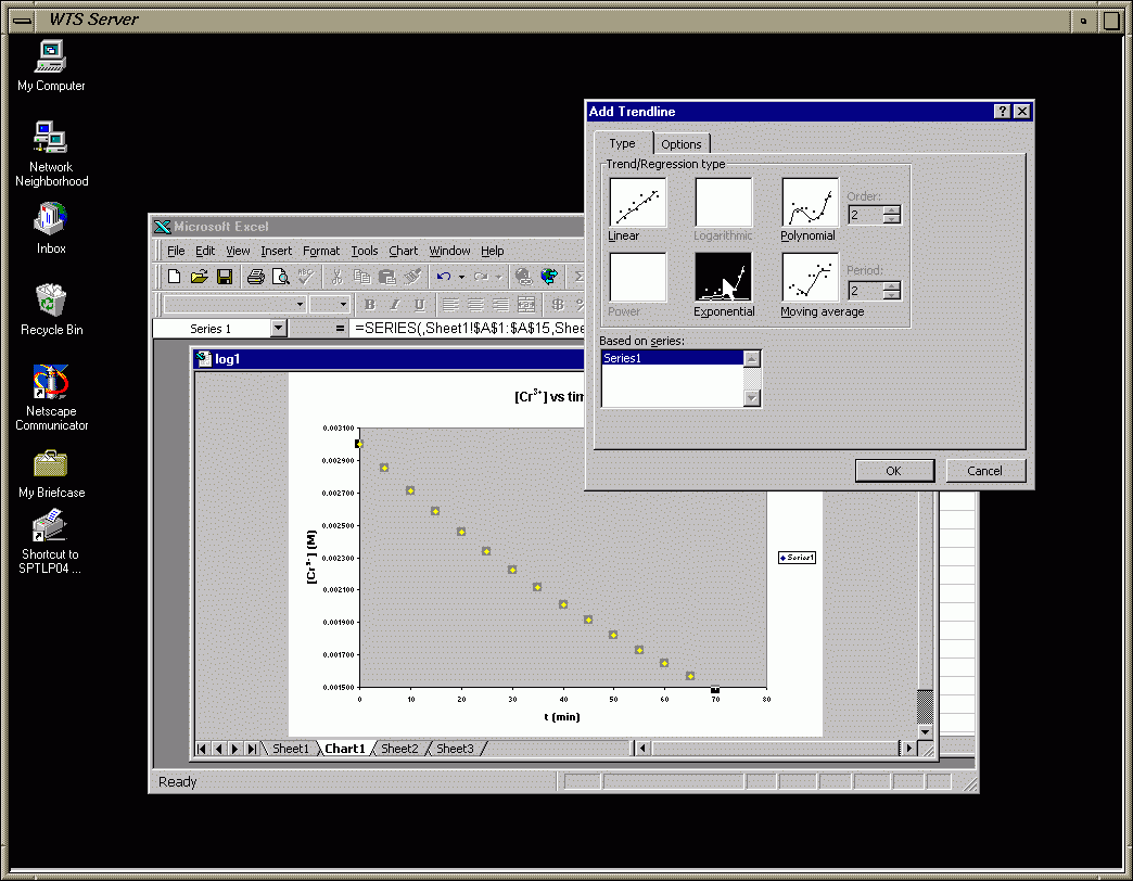
Frame 39 - Choose a Regression Type (I chose exponential)
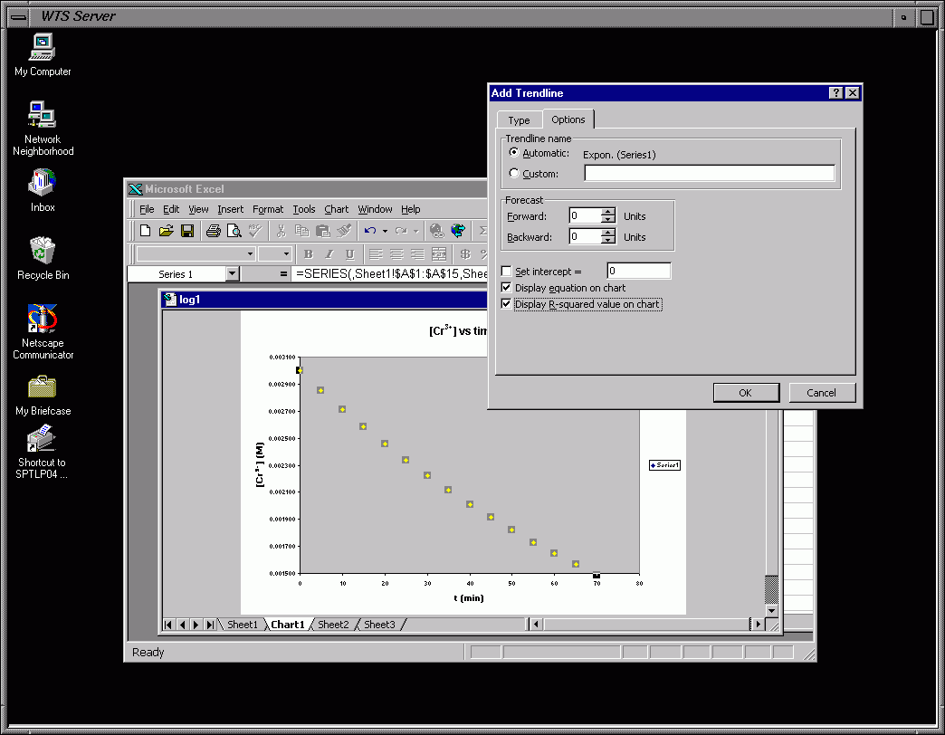
Frame 40 - Trendline Options (check options shown at bottom)
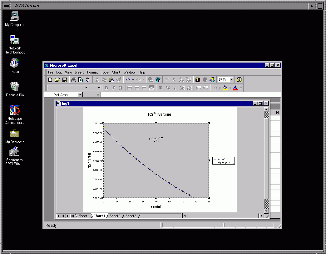
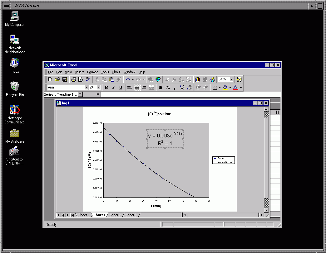
Frame 41 - Equation and R2 now Displayed on Chart
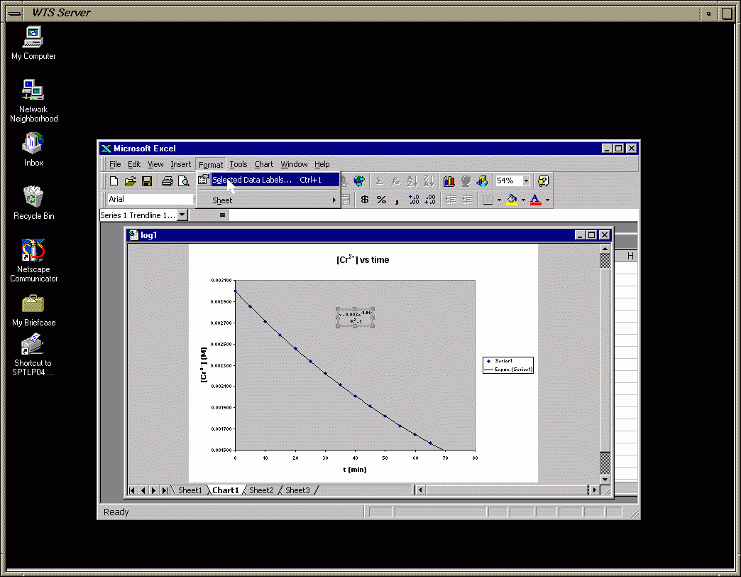
Frame 42 - Select Equation and R2
Frame 43 - Change Font Size (something readable but not as large as mine)
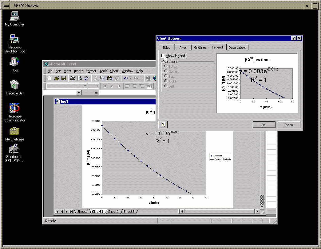
Frame 44 - Change Plot Legend (I removed the legend since I have only one plot)
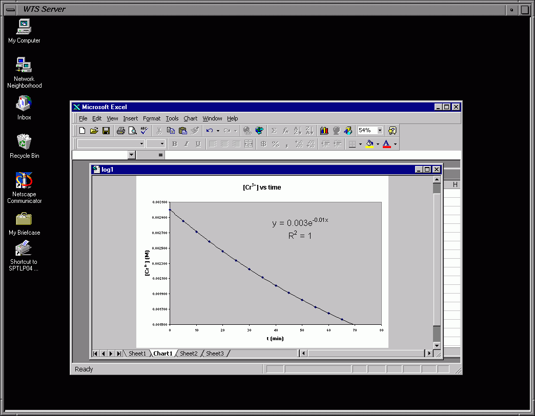
Frame 45 - "Almost" Finished Graph (Keep the legend since you will have 4 plots on same graph)
Frame 46 - Blow up of "Almost" Finished Graph
Look at the following link to get some overall pointers about
what a good graph should look like.  I've also included a finished graph using
someone's data for graph 2 (zero-order plot).  Use this as a guideline for what
a good graph should look like for this report (and others).
Graph 2 (Zero-order) - Examples of a good graph
You use graphs 3 & 4 to decide whether the reaction is 1st or
2nd order.  Graph 3 is ln[Cr3+]t vs. time and Graph 4 is
1/[Cr3+]t vs. time.  The way you use these graphs to decide the
order of the reaction is explained below.  Use Excel (see below). NO hand graphing using
graph paper.  Do NOT scan the graphs into your Word doc.  Transfer them from Excel or
copy them in Excel and paste into your Word doc.  Same for the tables.
We no longer do "hand"-graphing and expect the graphs to be done
using a graphing program such as Excel.  The following has been left
in to explain the pictures, which explain how to do certain things.
Please follow the instructions given in the manual and for graphing
using Excel below.
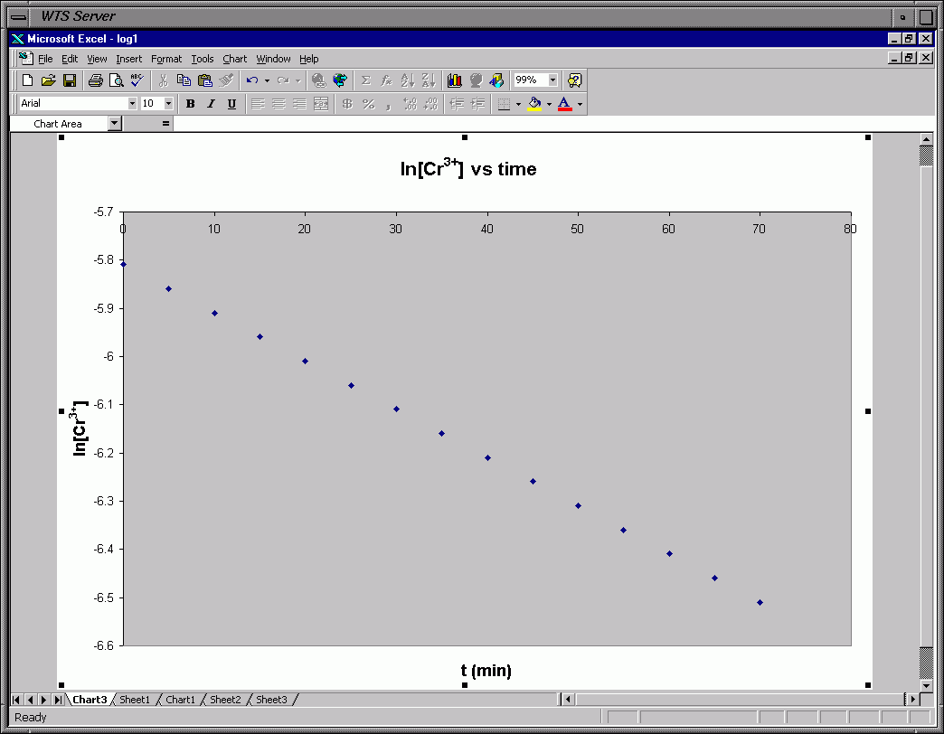
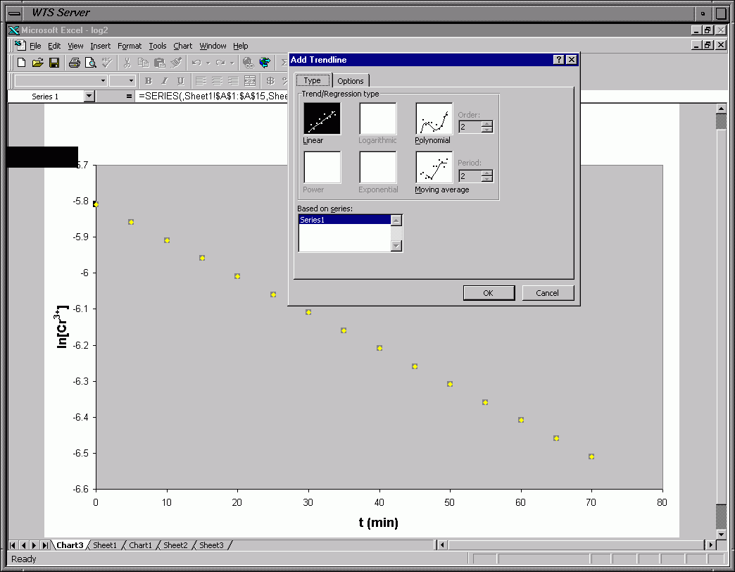
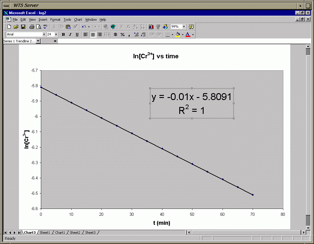
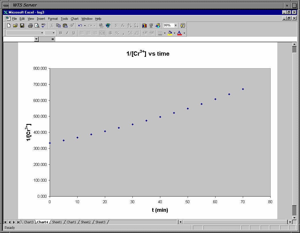
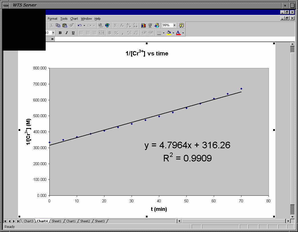
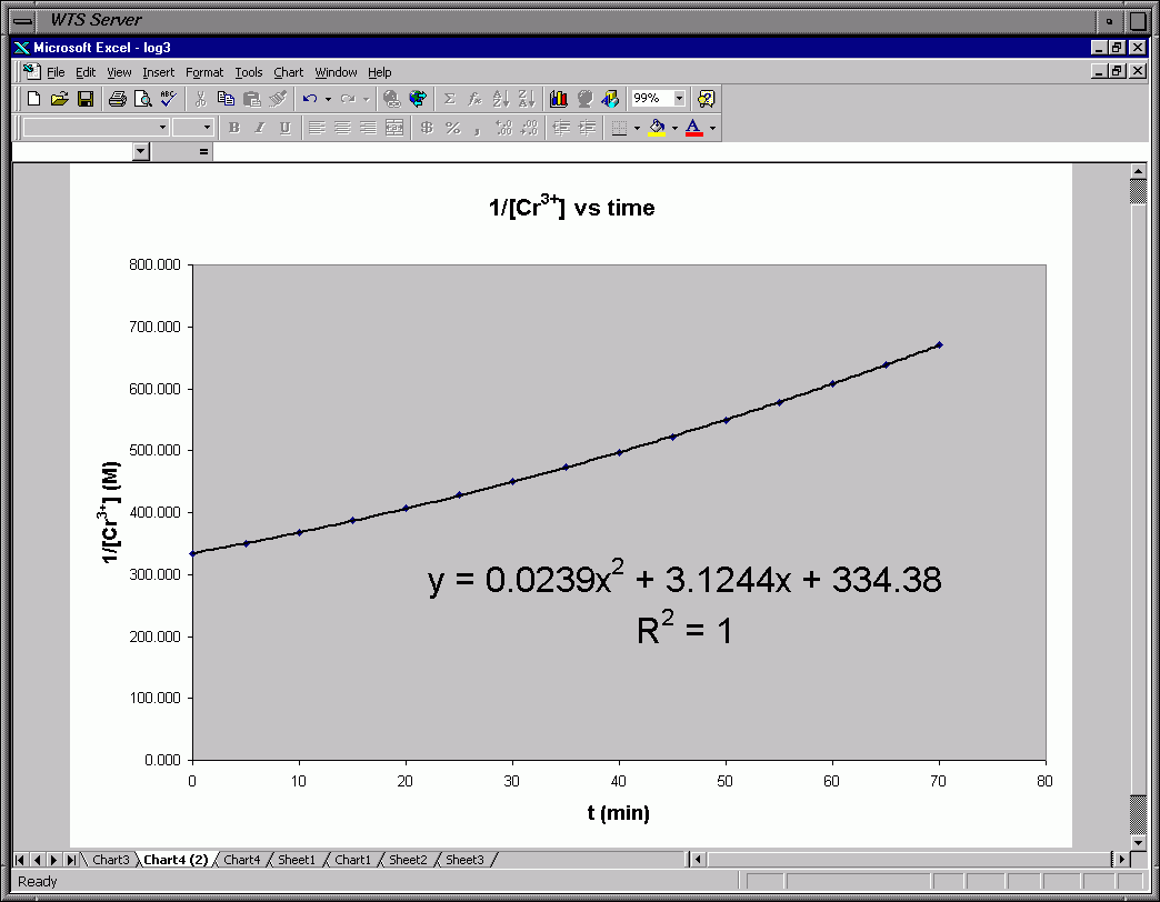
I've used Excel to do the "hand"-graphing.

The lab manual tells you to use the data for solution 3 and draw a smooth
best-fit curve for each graph and decide which looks more like a straight line.
This can sometimes be a little hard to tell.  If you look at the graph from
the side edge of the paper you can sometimes see the curvature of a line a little
better.  Decide which plot gives a straighter line.

An alternative is to fit each plot to a straight line and see which graph
better fits the points.  You will see one of the graphs has a straight line with
the points close to the line.  The other graph has points that aren't as close a
fit to a straight line (probably looks like a parabola compared to the line
straight line drawn).  You can leave them both as straight lines or redraw the
one that isn't a good linear fit as a curved fit (as I did in my example).

The plot that gives the better straight line tells you the order of the reaction.
If graph 3 (1st order plot) gives the better fit to a straight line then the
reaction is 1st order.  If graph 4 (2nd order plot) gives the better
fit to a straight line then the reaction is 2nd order.

Note in my example, Graph 3 (1st Order Plot) gives a perfect fit to a straight
line (R2=1) while Graph 4 (2nd Order Plot) is not fit as well as a
straight line (R2=0.99).  This makes sense since I chose my data to correspond
to a 1st order reaction in Cr3+.  I then redrew Graph 4 to make the
fit a nonlinear curve.  I chose a polynomial fit which gave an R2=1 (meaning
the data fit a polynomial curve better than a linear curve).

The slope of Graph 3 (1st Order Plot) is -0.01 min-1.  This slope
corresponds to -k (ln[Cr3+]t = -k*t + ln[Cr3+]0).
Therefore, my value for the rate constant, k, is 0.01 min-1.  The intercept
corresponds to the natural log of the initial concentration of Cr3+
(intercept = ln[Cr3+]0).

Once you do this and decide the order of the reacton go on to graph 5 and graph all
four solutions on the same graph according to the order you decided (either
1st or 2nd order) above.
Frame 47 - Start 1st Order Plot: ln[Cr3+]t vs. Time
Frame 48 - Choose Scatter Plot
Frame 49 - Plot after Formatting Titles and Removing Legend
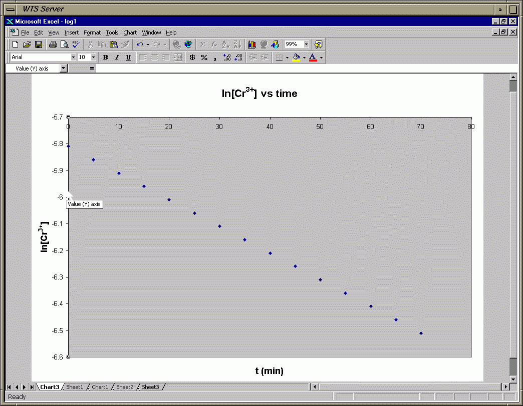
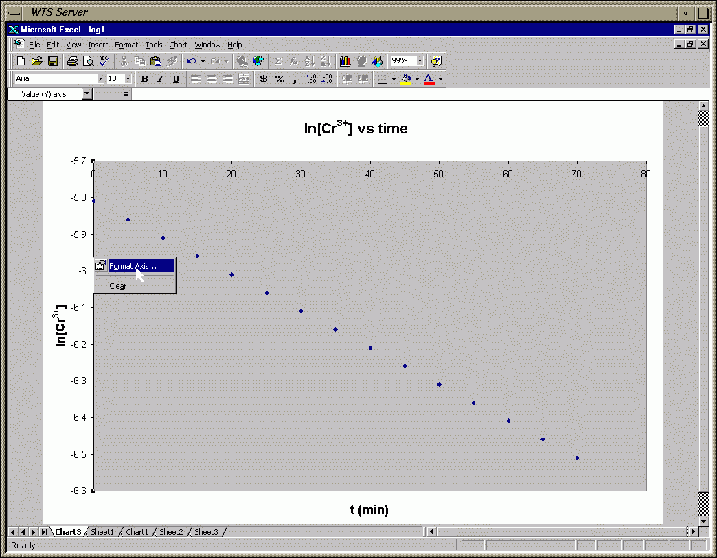
Frame 50 - Highlight Y-Axis for Formatting (Moving X-axis)
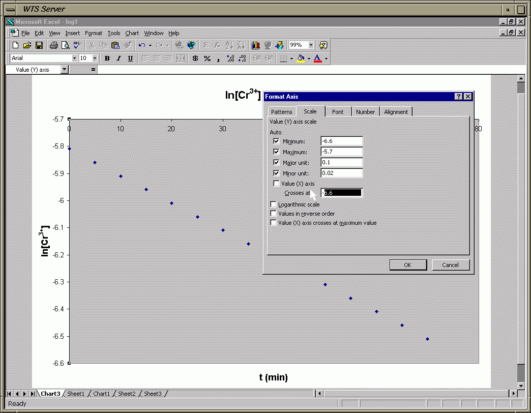
Frame 51 - Format Y-Axis (Moving X-axis)
Frame 52 - Format Y-Axis (change Value Where X-axis crosses Y-Axis)
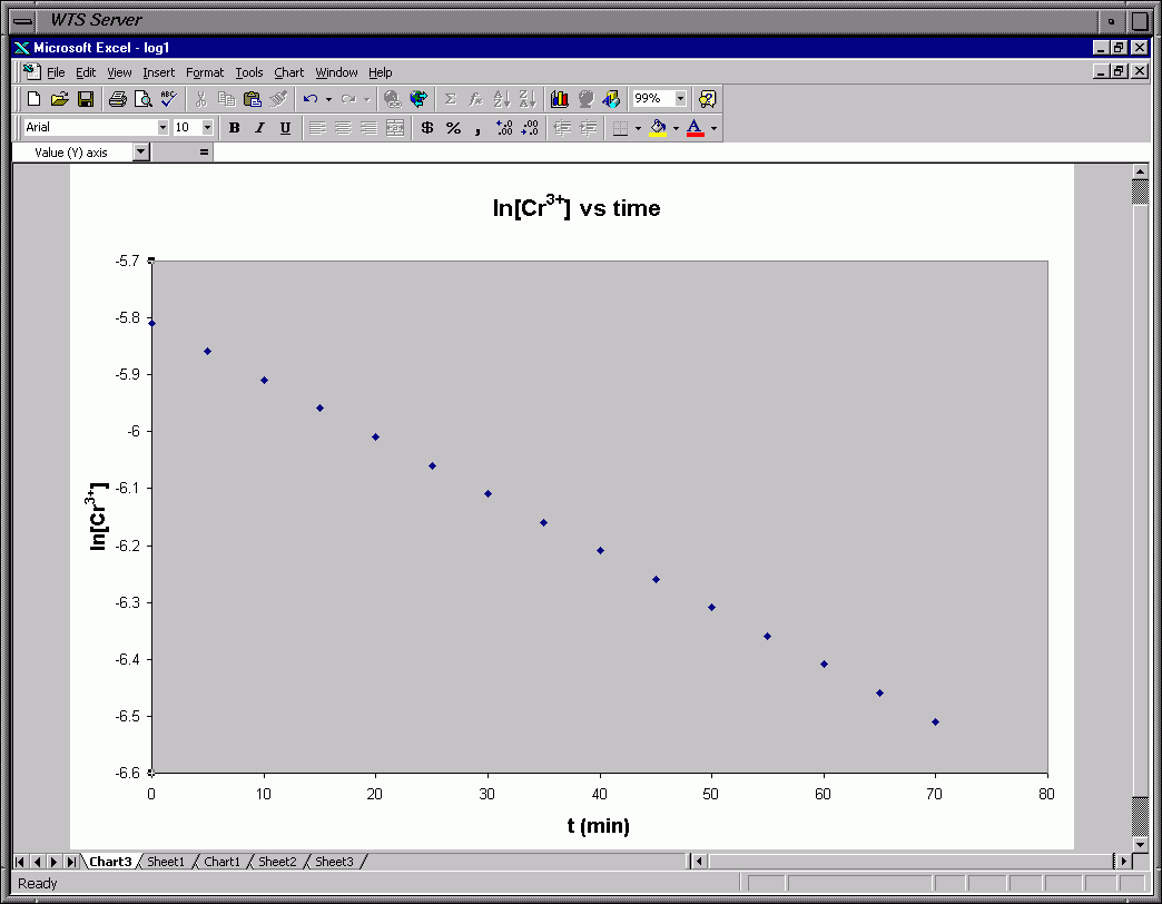
Frame 53 - X-axis Markings Moved from Top to Bottom of Graph
Frame 54 - Draw the Trendline - Choose Linear Regression
Frame 55 - Finished Graph with Line, Eqn and R2 (Perfect Fit - R2=1)
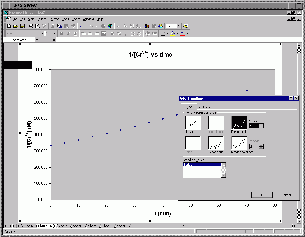
Frame 56 - 2nd Order Plot: 1/[Cr3+]t vs. Time with Data Points
Frame 57 - Draw the Trendline - Choose Linear Regression
Frame 58 - Finished Graph with Line, Eqn and R2 (Poorer Fit - R2=0.99)
Frame 59 - Redraw 2nd Order Plot as a Curved Trendline (Chose Polynomial)
Frame 60 - Finished 2nd Order Plot as a Polynomial (Better Fit - R2=1)
For graph 5 you decide whether the reaction is 1st or 2nd order and then graph
all 4 soltuions on the same graph whether it is a 1st or 2nd order graph.  You
decide this based on whether graph 3 (1st order plot) or graph 4 (2nd order plot)
gives a better linear fit (straight-line fit).  In my example I chose 1st order
since graph 3 above gave a better linear fit than graph 4.  Therefore, my Graph 5
would be ln[Cr3+]t vs. time for all 4 solutions.

On this graph you want to have a legend which shows the different symbols used
to plot the data points for each solution and the best fit lines corresponding
to these data points.
You use graphs 3 & 4 to decide whether the reaction is 1st or 2nd order.
Graph 3 is ln[Cr3+]t vs. time and Graph 4 is 1/[Cr3+]t vs. time.

Do ALL 4 solns on the 1st and 2nd order plots (graphs 3 and 4).
Use LINEAR trendlines for both graphs and just leave them as linear
fits.  Include the equation for the line and the correlaton coefficent
(R2.  You should NOT use the correlaton coefficent (R2)
values to decide which set of data fit a linear trend line better (what
is the correct order).  The R2 values will be very close for
both graphs. Instead look to see which graph, first or second order,
gives 4 more nearly parallel lines.  Remember, the slope is related
to the rate constant.  That means if you have perfect data you should
have 4 parallel lines on the graph which is the correct order.
The other graph will have lines that start converging at one end and
diverging at the other (aren't as nearly parallel).
This is also in the lab manual.

The slope of a line corresponds to the rate constant.
For a first-order reaction the slope equals '-k' (ln[Cr3+]t = -k*t + ln[Cr3+]0).
For 1st-order the intercept corresponds to the natural log of the initial
concentration of Cr3+ (intercept = ln[Cr3+]0).
For a second-order reaction the slope equals 'k' (1/[Cr3+]t = k*t + 1/[Cr3+]0).
For 2nd-order the intercept corresponds to the the reciprocal of the initial
concentration (intercept = 1/[Cr3+]0)
Graphs 3 & 4 - Exs of what Graphs 3 & 4 might look like